A grocery run can feel routine, but stores are carefully designed to shape what you see, what you crave, and what ends up in your cart. Many of the tactics are so familiar that they barely register, even though they can quietly raise your total. This gallery breaks down nine common supermarket strategies in clear, everyday language so you can shop with your eyes open and your budget intact.
The produce section is placed at the entrance
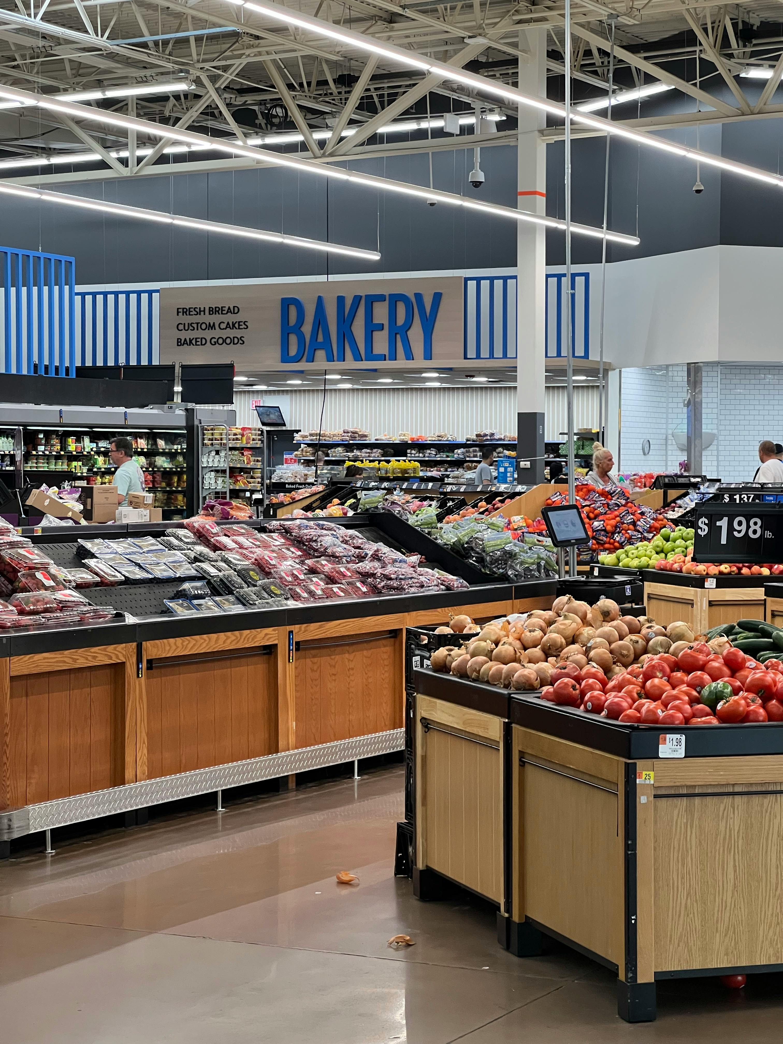
The first thing many shoppers see is a wall of color: polished apples, misted greens, and stacked citrus glowing under flattering light. That opening scene is not accidental. Stores often place produce up front because it creates a fresh, healthy first impression and puts shoppers in a positive mood as soon as they walk in.
There is also a psychological effect at work. When people begin with virtuous choices like fruit and vegetables, they may feel more comfortable loosening up later in the trip. Researchers and retail experts have long noted that early cues can influence later decisions, which is why the entrance is treated like a stage set rather than just a doorway.
Staples are pushed to the back of the store

If milk, eggs, and bread are the only things on your list, the store still wants you to walk past dozens of other products to get them. That is why essential items are often placed along the perimeter or deep in the back. The layout increases the number of shelves you pass, which increases the odds of unplanned purchases.
This strategy works because exposure matters. The more often you see a product, the more familiar and appealing it can feel in the moment. Even a quick trip for one item turns into a mini tour through snacks, frozen foods, seasonal displays, and convenience items, each one creating another chance to spend.
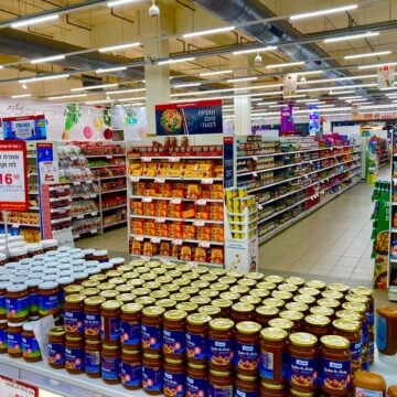
Eye-level shelves get the premium real estate

Where a product sits on the shelf can matter almost as much as what it costs. Brands often pay for better placement, and stores know that eye-level space gets the most attention. Items in that zone are easier to notice, easier to reach, and more likely to land in your cart without much comparison shopping.
Less expensive alternatives are frequently tucked higher, lower, or farther to the side. Shoppers in a hurry may never scan those spots. Children's cereals and sugary snacks can also be placed at kid eye level, which adds another layer of pressure for parents. The shelf may look neutral, but it is often a carefully sold and studied advertising surface.
End caps are built to trigger impulse buys

Those displays at the ends of aisles are some of the most valuable spots in the store. End caps interrupt your path, grab your attention, and make products feel timely or important. They are often stocked with seasonal goods, limited-time flavors, or familiar brands that benefit from a little extra visibility.
The catch is that end-cap placement can make an ordinary item seem like a deal even when it is not discounted at all. Because the display stands apart from the regular shelf, shoppers often assume it has been specially selected for value. In reality, it may simply be there because a supplier paid for the placement or because the product needs a sales boost.
Price tags are designed to feel smaller
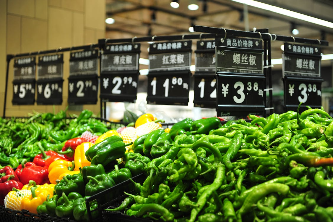
A lot can happen in a tiny shelf label. Stores and brands know that how a price looks can influence how it feels, so tags often emphasize bold sale colors, large unit prices, or endings like .99 that create the impression of a bargain. A product priced at $4.99 can feel meaningfully cheaper than $5.00, even when the difference is just a penny.
Multi-buy offers add another layer. Signs such as 2 for $7 or 3 for $10 can push shoppers to buy more than they intended, even when a single item is available at the same per-unit price. The wording creates urgency and value in one glance, which is exactly what it is meant to do.
Music and lighting are used to slow you down
A supermarket is not just arranged visually. It is also tuned like an atmosphere. Softer music can encourage a slower walking pace, while warm, even lighting can make food look more appealing and the store feel pleasant enough to linger in. The longer shoppers stay, the more likely they are to notice extras they did not plan to buy.
Different departments may even get different treatment. Bakery areas often use lighting that makes crusts glow and pastries look freshly finished. Prepared foods and produce are frequently lit to highlight texture and color. These choices seem subtle because they are supposed to, but they are part of a larger effort to turn shopping into a more emotionally driven experience.
The smell of fresh food is part of the sell
Few things spark appetite faster than the smell of warm bread or rotisserie chicken. Stores often place bakeries, deli counters, or hot food sections where those aromas can drift into main traffic areas. Scent is powerful because it bypasses careful comparison and goes straight to appetite, memory, and comfort.
That can make shoppers buy with their senses instead of their lists. Even if you came in for detergent and yogurt, the smell of cookies or roasted meat can suddenly make dinner feel urgent. This is one reason shopping hungry is such a costly habit. The environment is already designed to activate cravings before you have made a single deliberate choice.
Oversized carts make purchases look small
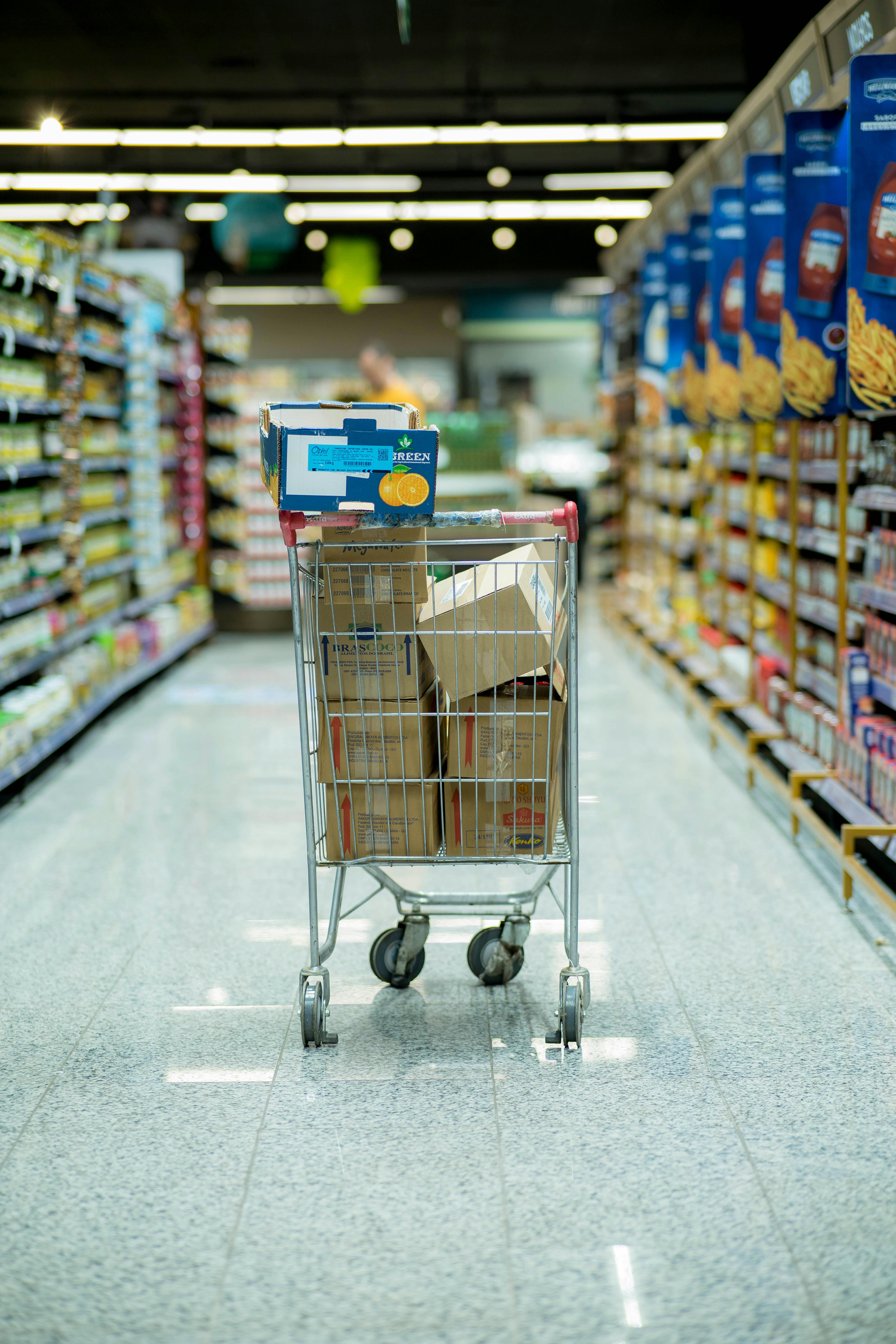
Shopping carts have grown over the years, and that change is not only about convenience. A larger cart makes a few items look like almost nothing, which can subtly encourage shoppers to keep adding more. People often judge quantity visually, so an underfilled cart can create the feeling that they have not bought very much yet.
Retail analysts have pointed out that cart size can affect buying behavior, especially in large-format stores. The same effect can happen with roomy baskets and wide aisles that make it easy to keep moving and loading up. When your groceries take up less apparent space than expected, your budget can slip before you realize how full the cart really is.
Checkout lanes are packed with last-minute temptations

The checkout area is where willpower is tired and waiting time works against you. Candy, gum, magazines, mini drinks, and small toys are placed there because they are easy to grab without much thought. These are low-cost items individually, but they add up quickly and often enter the cart outside any real plan.
This zone is especially effective with children and rushed adults. A few minutes in line creates just enough idle time for cravings and impulse decisions to creep in. Retailers know that convenience matters at the finish line. If an item can be seen, reached, and justified in seconds, it has a strong chance of becoming one more unplanned purchase.


Leave a Reply