A cereal box can cross the border, but its label usually cannot. What looks like a small packaging change often reflects two very different regulatory systems.
Different regulators set different rules
At the most basic level, food labels look different because Canada and the United States do not answer to the same government authorities. In Canada, Health Canada sets many nutrition and ingredient policies, while the Canadian Food Inspection Agency enforces food labeling rules in the marketplace. In the US, the Food and Drug Administration oversees most packaged foods, and the US Department of Agriculture handles meat, poultry, and some egg products.
That split matters because each country writes its own technical standards. Rules can differ on what must appear on the front of pack, how allergens are declared, which claims are allowed, and what format the Nutrition Facts table or panel must follow. Even small wording differences can force a company to redesign an entire package.
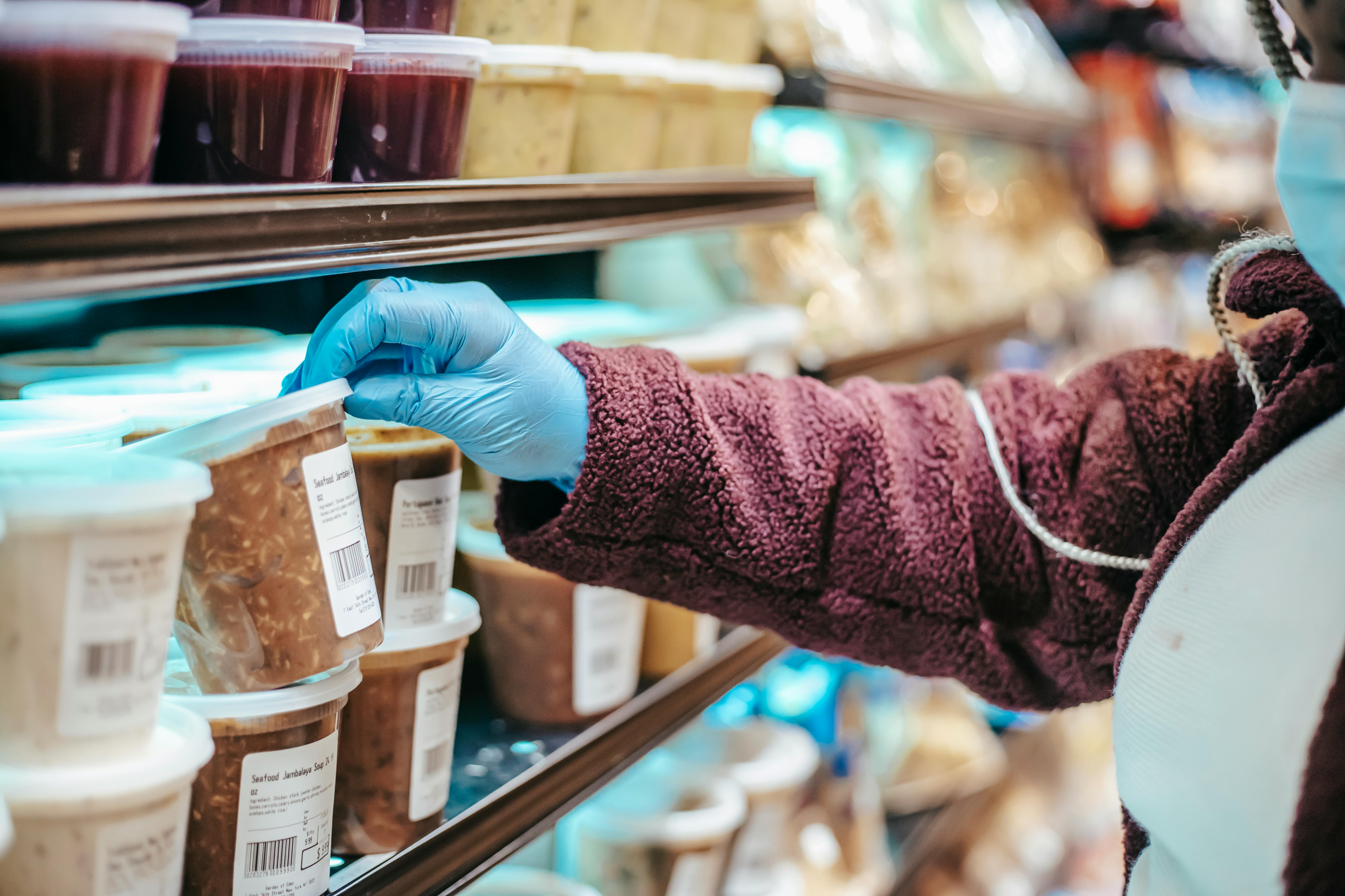
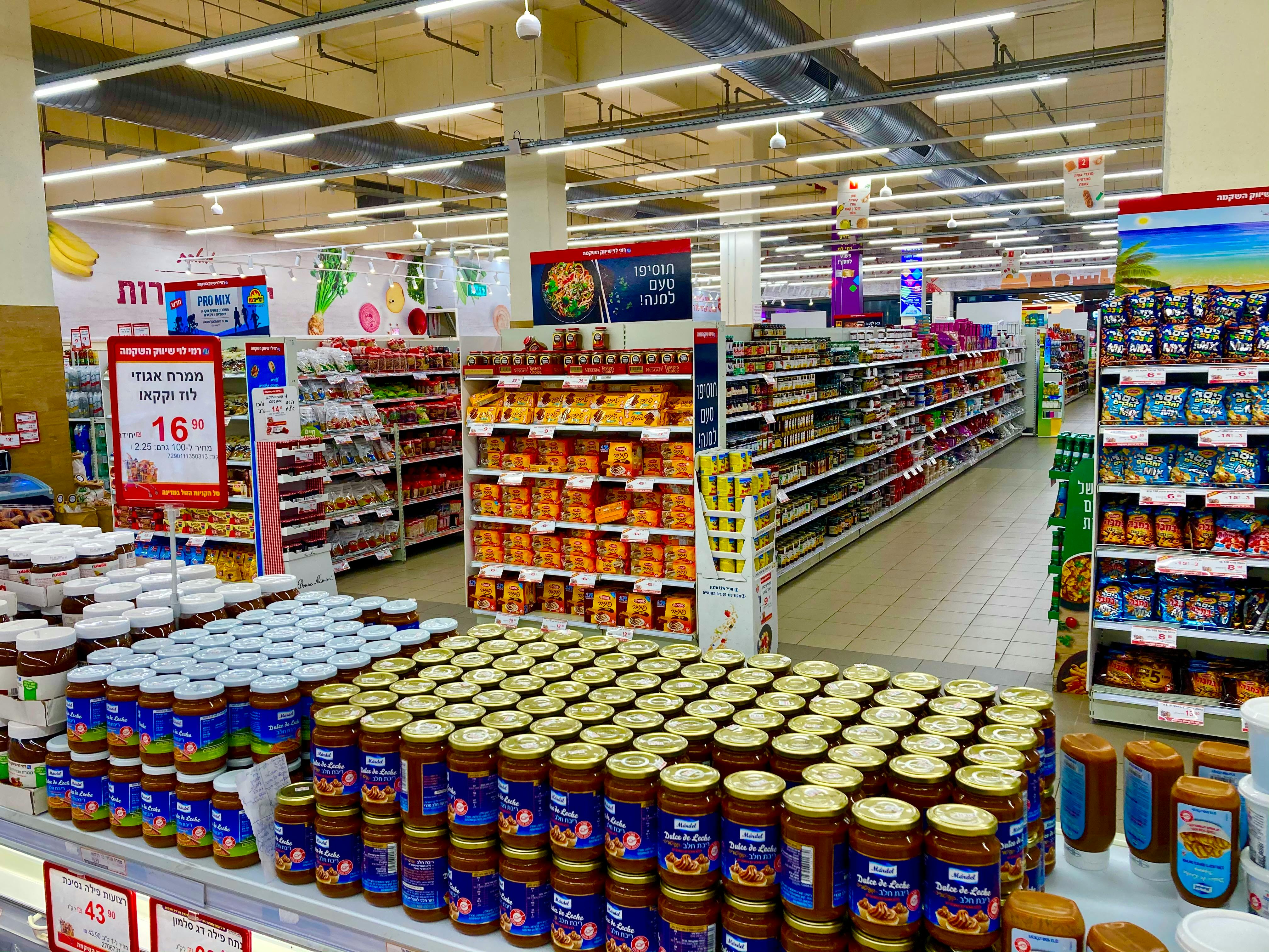
A product sold by the same multinational brand may therefore have one label for Canada and another for the US. This is common with snacks, frozen foods, yogurt, cereal, and beverages. Companies often prefer separate packaging rather than risking a noncompliant label in either market.
The result is not usually about marketing alone. It is often a legal necessity. A package has to satisfy the country where it is sold, and regulators can require changes that consumers notice immediately, from font layout to warning language.
Bilingual packaging changes the entire design
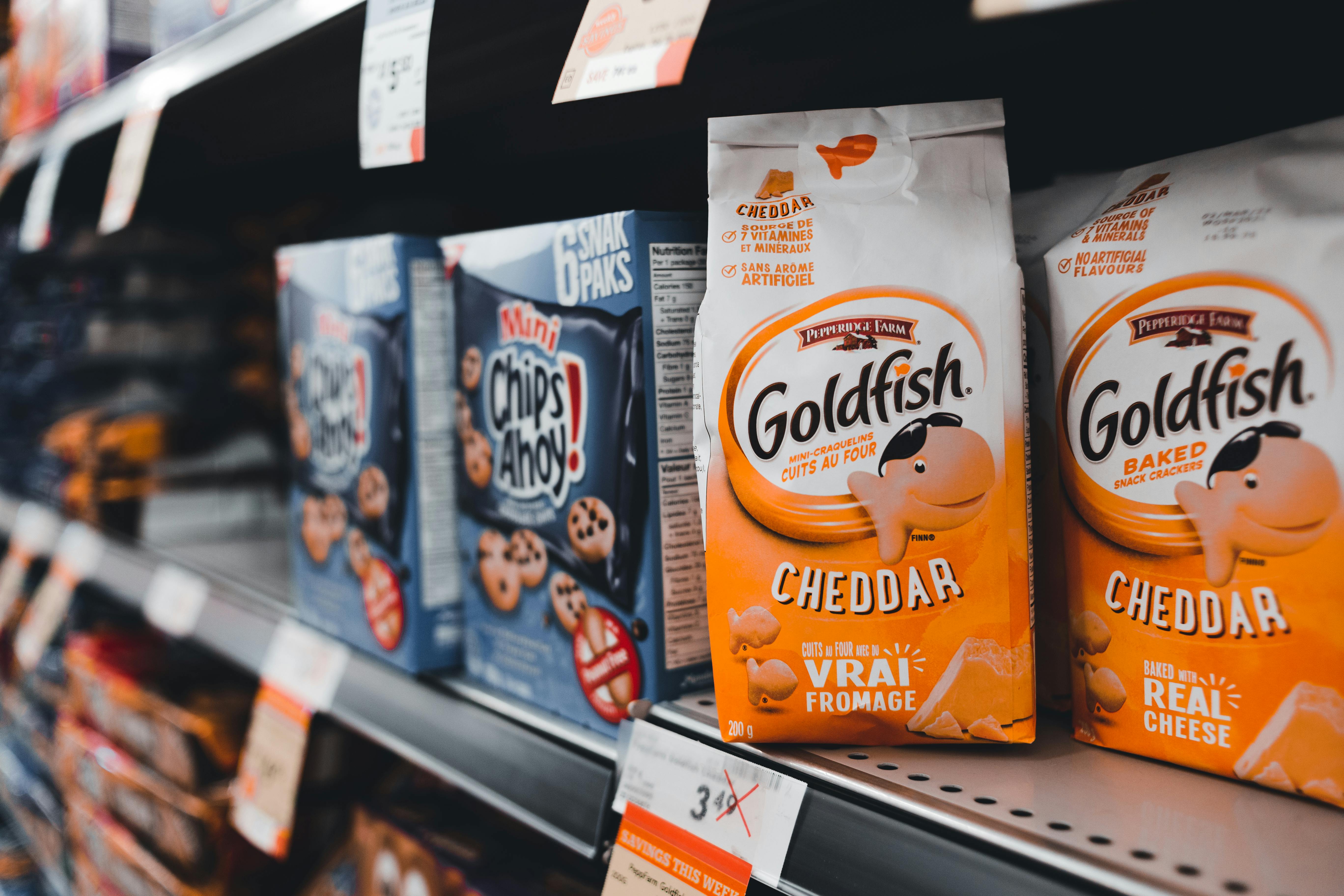
One of the most obvious Canadian differences is language. Most packaged foods sold in Canada must include mandatory information in both English and French. That includes product identity, ingredient lists, nutrition details, allergen statements, storage instructions, and many claims that appear elsewhere on the package.
This requirement affects far more than translation. It changes spacing, font size, panel layout, and the amount of usable design space on the box, can, pouch, or bottle. A front label that looks clean and minimal in the US may appear more crowded in Canada simply because it has to communicate the same legal information twice.
Quebec's language rules also influence packaging decisions, especially for products distributed nationally. Many brands choose one bilingual package for all of Canada rather than separate regional versions. That makes production simpler, but it also means the Canadian package often looks noticeably different from its US counterpart.
Consumers sometimes assume the Canadian package contains more warnings or more text because the product is somehow more complex. In reality, much of that extra wording exists because federal and provincial language requirements leave less room for the streamlined visual style common on US shelves.
Nutrition panels follow different formats and priorities

Put a Canadian Nutrition Facts table beside a US Nutrition Facts label and the differences stand out quickly. Canada and the US both require calories, serving size, and nutrient data, but they do not always present those details in the same way. Typography, border style, spacing, daily values, and mandatory nutrients can vary.
Canada has updated its labeling rules in recent years to make serving information and sugar content easier to understand. Some products must group sugars-based ingredients in the ingredient list, helping shoppers recognize when multiple sweeteners are being used. The US has also modernized labels, including adding "Added Sugars," but the formatting and emphasis still differ.
Serving sizes are another source of confusion. A Canadian package may show a reference amount or serving format that does not match the US version of the same food. That can make direct nutrition comparisons difficult, especially for products like ice cream, chips, breakfast cereal, and soft drinks.
These are not cosmetic choices. They reflect different public health priorities, review processes, and timelines. When one country updates nutrition science or consumer guidance faster than the other, labels begin to drift apart even when the product inside remains nearly identical.
Ingredient naming and allergen rules are not identical
The ingredient list often reveals some of the sharpest cross-border differences. Canada and the US both require ingredients to be listed in descending order by weight, but the naming conventions do not always match. A color additive, sweetener, preservative, or flour treatment agent may be described one way in Canada and another in the US.
Allergen labeling is a major factor. Both countries take common allergens seriously, yet they do not use perfectly identical language or formatting rules. Canada has specific emphasis on priority allergens, gluten sources, and sulfites, while the US follows its own major allergen framework and has updated some rules over time, including sesame.
That can lead to labels that look more explicit in one country than the other. A statement such as "Contains: milk, soy" may be placed or styled differently, and precautionary statements like "may contain" can appear in forms shaped by local guidance and legal review. The practical effect is a visibly different package.
For shoppers with allergies, these differences matter far beyond appearance. People who regularly buy food on both sides of the border often learn to read labels twice, not once. A familiar brand name does not guarantee familiar wording, and that can affect trust, safety, and purchase decisions.
Claims, symbols, and front-of-pack messaging vary
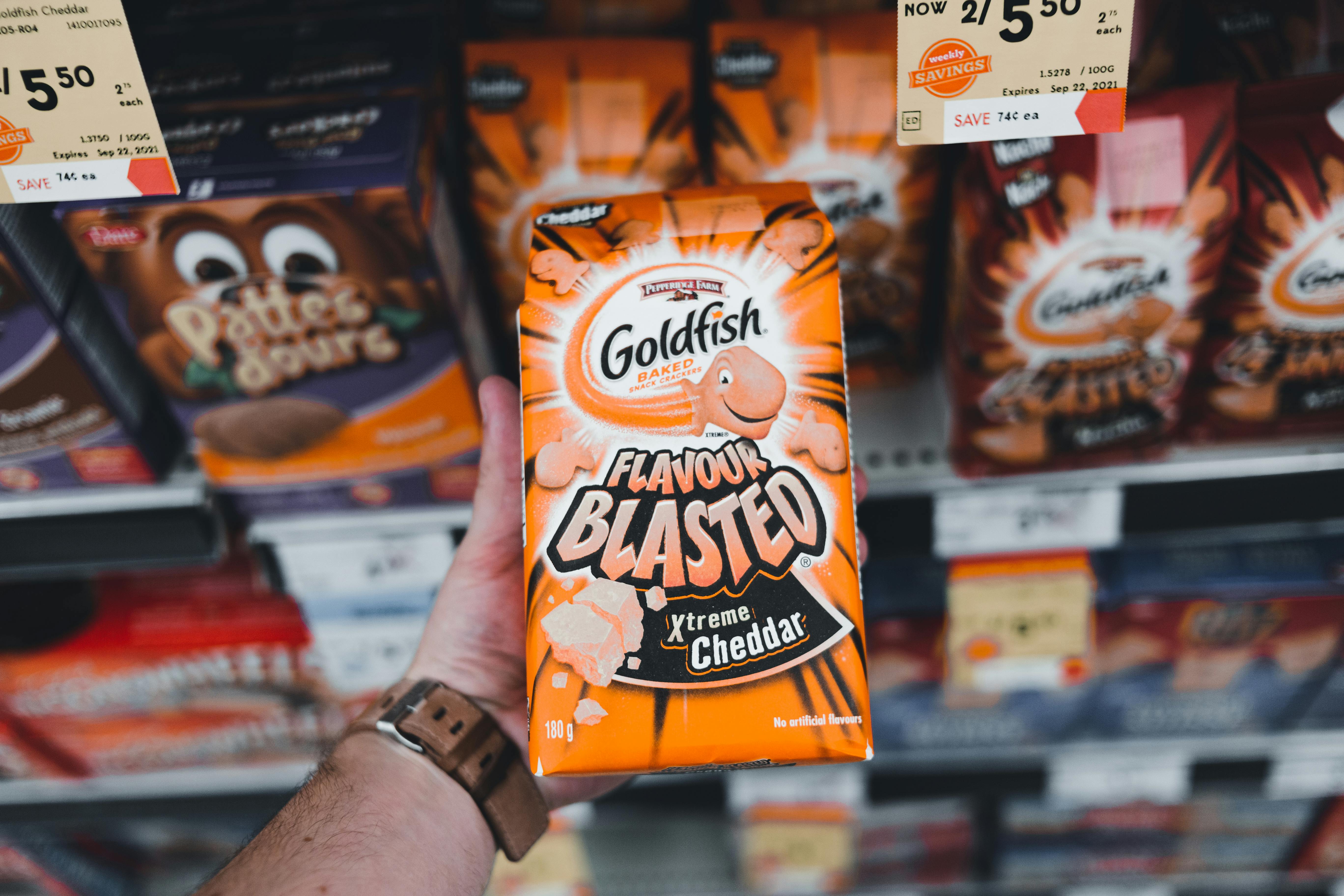
What a label is allowed to promise is another big reason Canadian and US packages diverge. Claims such as "good source of fiber," "reduced sodium," "light," "organic," or "natural" may be governed by different definitions, thresholds, or enforcement practices. A phrase that is acceptable in one country may need different wording in the other.
Canada has also moved toward stronger front-of-package nutrition labeling for foods high in sodium, sugars, or saturated fat. As these rules phase in, certain packaged foods will need a prominent symbol on the front. That creates a major visual difference from many US packages, where no equivalent nationwide symbol system applies in the same way.
Third-party marks can differ too. Organic certification seals, non-GMO messaging, recycling icons, and nutrient callouts may follow country-specific conventions. Even when the same seal appears, companies may adjust placement to make room for mandatory Canadian text or panel requirements.
In practice, this means a US package may look more promotional while a Canadian version looks more informational. That impression is not always fair, but it reflects the reality that front-of-pack space is tightly controlled and every country makes different choices about what consumers should see first.
Packaging strategy, trade, and consumer expectations matter too
Not every difference starts with the law. Manufacturing strategy plays a role as well. Some brands create one package for Canada, another for the US, and sometimes a third for warehouse clubs or bilingual export markets. Packaging runs are planned around factory lines, retailer demands, and the cost of printing multiple versions.
Trade patterns also shape label design. Products imported into Canada may need stickers or fully revised packaging to meet local rules before they can be sold legally. Shoppers sometimes see this on specialty foods, seasonal items, and limited releases, where imported goods carry extra labels to add French text or Canadian nutrition information.
Consumer expectations influence design choices too. Canadian shoppers are used to bilingual presentation and a standardized Nutrition Facts table, while US shoppers are used to a different visual rhythm. Brands want packages to feel familiar on local shelves, so they often adapt color blocks, claim placement, and product descriptions even beyond what the law requires.
So when two packages look different, the explanation is usually layered. Regulation is the backbone, but language, health policy, manufacturing, trade compliance, and shopper habits all shape the final result. The label is not just a wrapper. It is a map of how each country thinks food information should be delivered.


Leave a Reply