
You have probably seen it without realizing it. A cereal box, ketchup bottle, or candy wrapper from a famous American brand looks almost the same in Canada, but not quite.
The smallest difference is often the most important
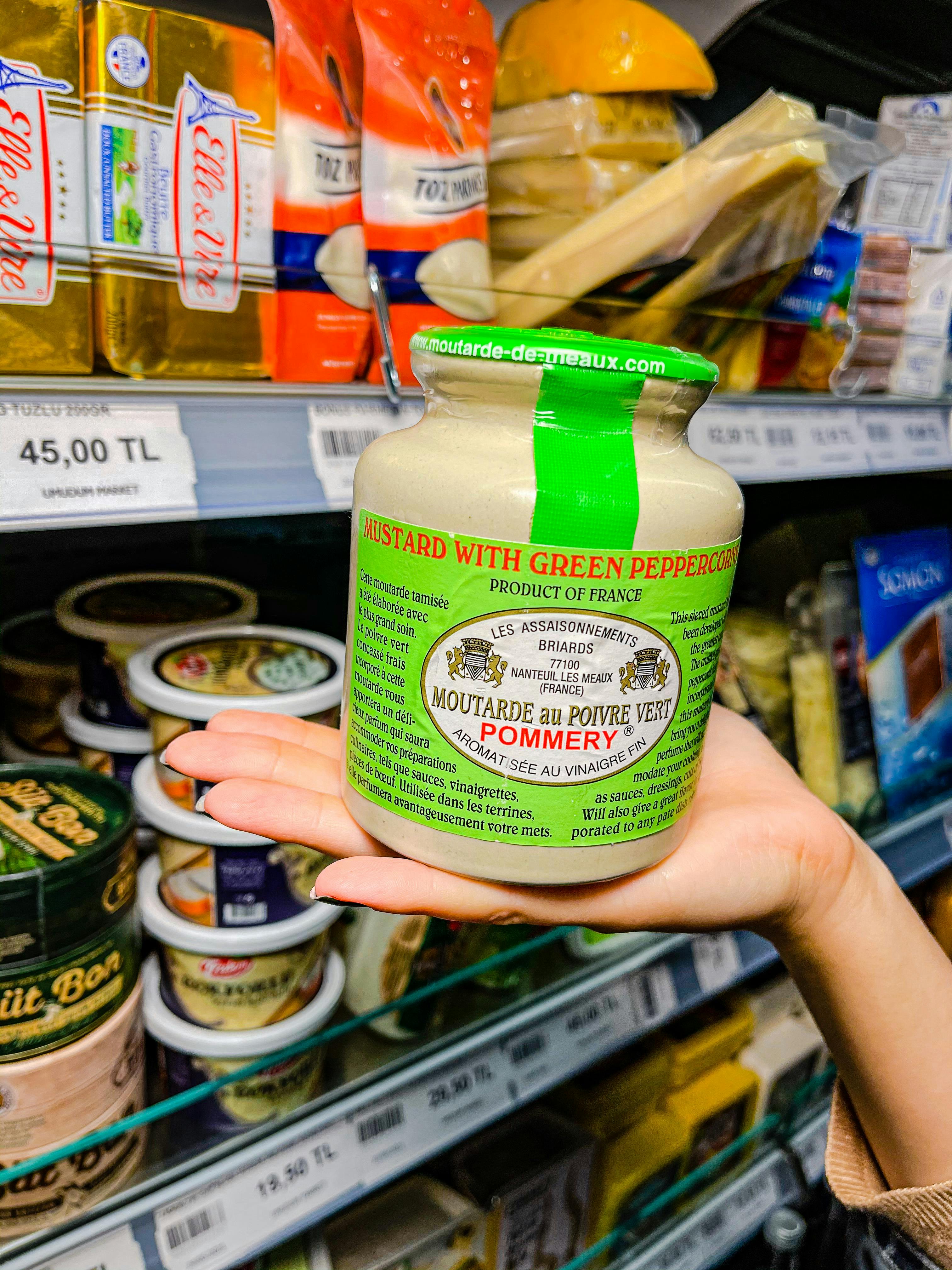
At first glance, many American food products on Canadian shelves appear identical to the ones sold in the United States. The colors match, the logos are familiar, and the mascots are usually unchanged. That visual consistency is intentional because global brands spend heavily to protect recognition across borders.
The tiny detail most people overlook is the label text. In Canada, packaged foods generally need bilingual information in English and French, a requirement shaped by federal law and the country's linguistic identity. That means brand owners must redesign packaging layouts, even when the food inside is nearly identical.
This is why a box can feel more crowded, denser, or slightly rearranged. Nutrition facts, ingredient lists, allergy warnings, and storage instructions all have to fit while remaining legible. The result is a package that looks familiar but carries a distinctly Canadian structure.
Canadian law shapes the shelf before shoppers ever arrive
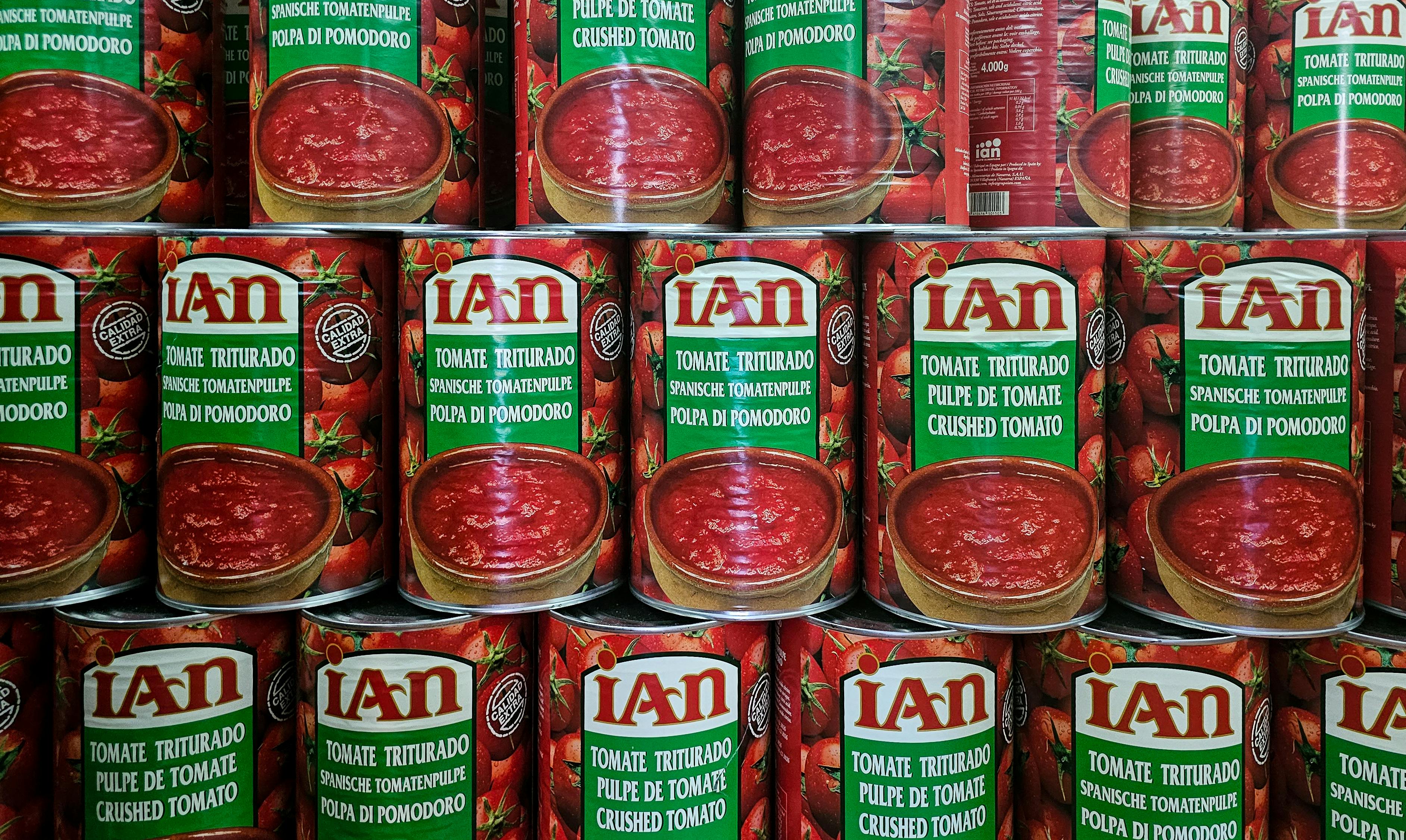
Packaging differences are rarely cosmetic accidents. They are usually the end result of compliance with rules enforced by agencies such as the Canadian Food Inspection Agency and Health Canada, which regulate labeling, claims, ingredients, and consumer clarity.
Canadian labels may use different serving descriptions, mandatory statements, and formatting standards from U.S. labels. Even where the two countries align broadly, details can diverge enough to force a separate print run. For a major brand, that can mean maintaining parallel packaging systems for North America.
Claims that sound ordinary in the U.S. may also need adjustment in Canada. Terms related to health benefits, fortification, organic status, and even flavor descriptions can face different standards. So a package may not just be translated; it may be legally rewritten.
French changes more than language alone
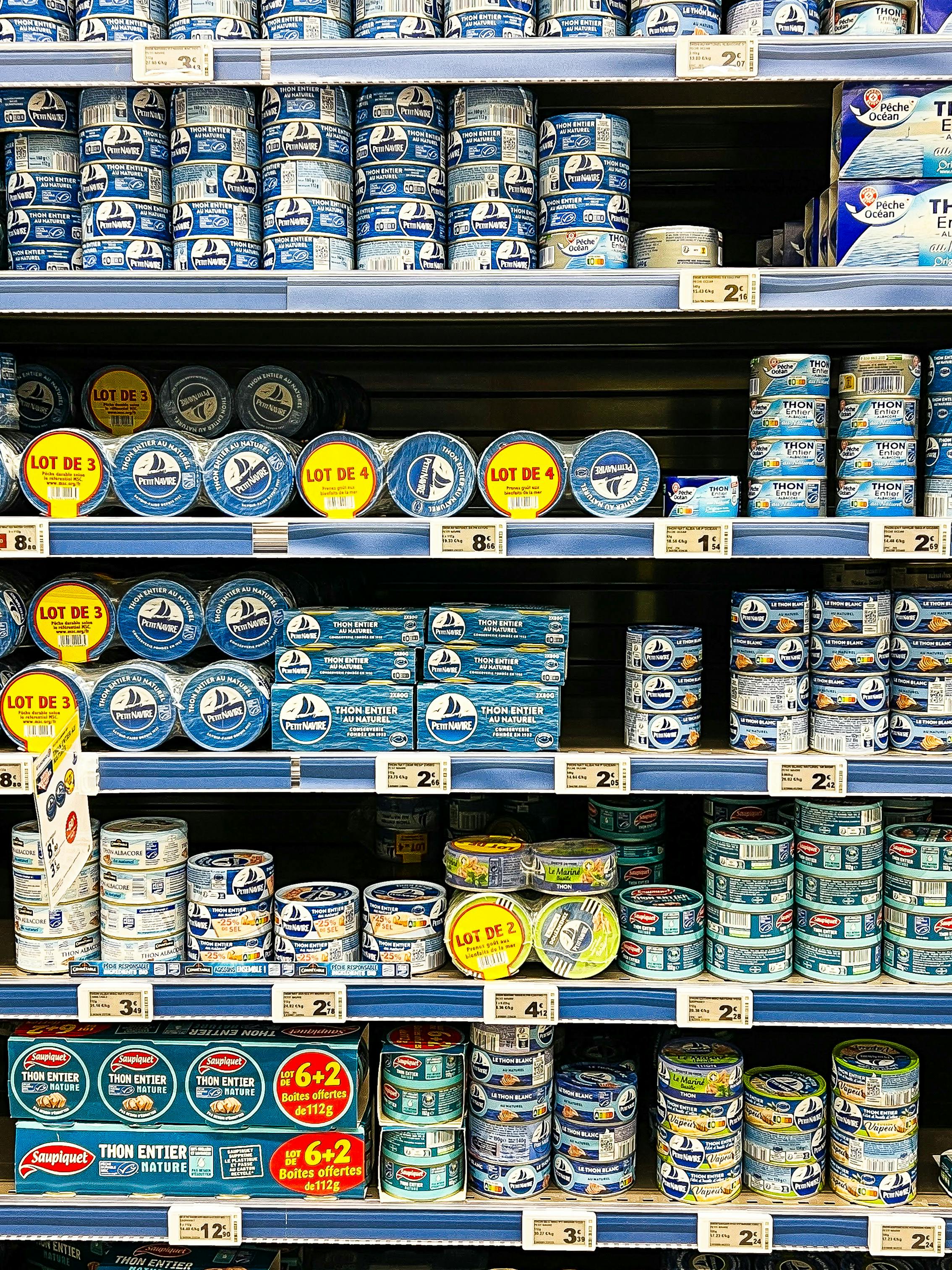
Adding French does more than duplicate English text. It changes spacing, hierarchy, and the entire visual balance of a package because French phrases are often longer, and legal wording cannot simply be shortened for convenience.
Design teams often have to shrink fonts, move icons, or rework side panels. A nutrition table might need to sit differently, and promotional bursts on the front may be reduced to make room for mandatory bilingual copy. That can make the Canadian version look busier or less bold.
In Quebec, language expectations are especially important in retail presentation. Even when a product is sold nationally, companies often design with Quebec compliance and consumer readability in mind first. That practical choice influences what ends up on shelves across the whole country.
Ingredients and recipes can change too
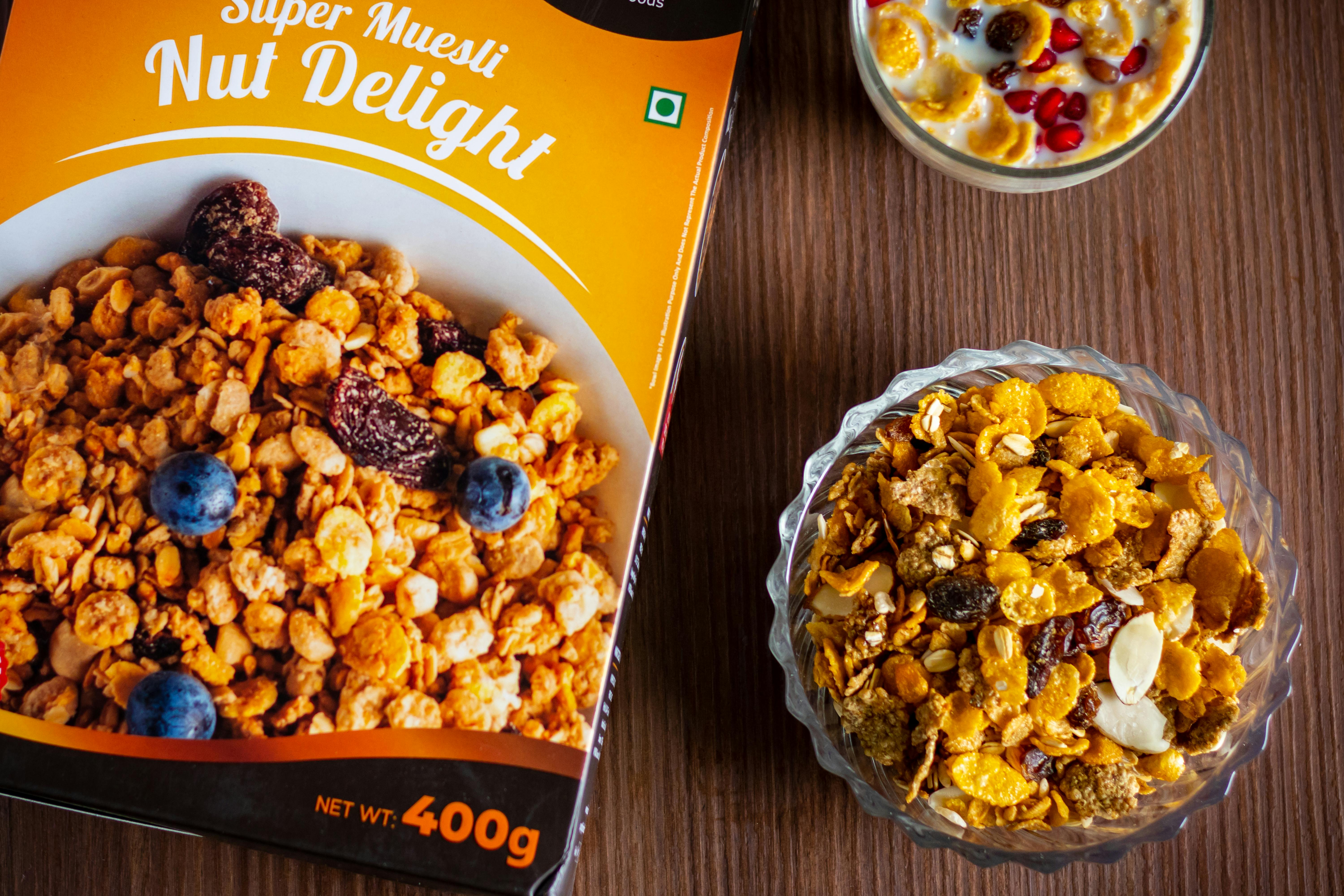
Sometimes the difference is not only visual. American brands may alter ingredients for Canada because of local standards, sourcing realities, or market preferences, which can then require additional wording changes on the label.
Color additives are a common example. Some ingredients accepted in one market may face different treatment, naming rules, or consumer expectations in another. A familiar candy or snack can therefore look slightly different outside and taste a little different inside.
Fortified foods also reveal these contrasts. Breakfast cereals, dairy-related products, and drinks may carry different vitamin and mineral profiles in Canada than in the United States. Once the formula shifts, the nutrition facts panel, claims, and ingredient order often shift with it.
Brands also tailor packaging to how Canadians shop

Regulation explains a lot, but marketing explains the rest. Companies know Canadian shoppers recognize American brands, yet they also respond to local habits, seasonal trends, and price expectations that differ from those in the U.S.
That is why pack sizes, promotional messages, and even flavor lineups can vary. A brand may highlight family value, winter comfort, or hockey-season tie-ins in Canada while emphasizing entirely different cues in American stores. The design remains related, but the selling language changes.
Retail structure matters too. Canada's smaller population and different distribution geography encourage more selective product ranges. Brands may simplify certain lines, reserve limited editions, or adjust bilingual artwork for club stores, grocery chains, and convenience channels differently than they do in the U.S.
What shoppers are really noticing without naming it

Most consumers do not stand in an aisle thinking about federal labeling frameworks. What they notice instead is a subtle sense that the package feels fuller, more formal, or arranged in a less airy way than its American counterpart.
That instinct is usually correct. Canadian packaging often carries more mandatory visible information in the same physical space, and that creates a different design rhythm. It is not necessarily worse or better, just built for a different legal and cultural environment.
So the next time an American food brand looks slightly off in Canada, look closely at the fine print and panel layout. The tiny detail you probably never noticed is not just translation. It is the visible footprint of how a country regulates food, speaks to consumers, and defines its marketplace.




Leave a Reply