
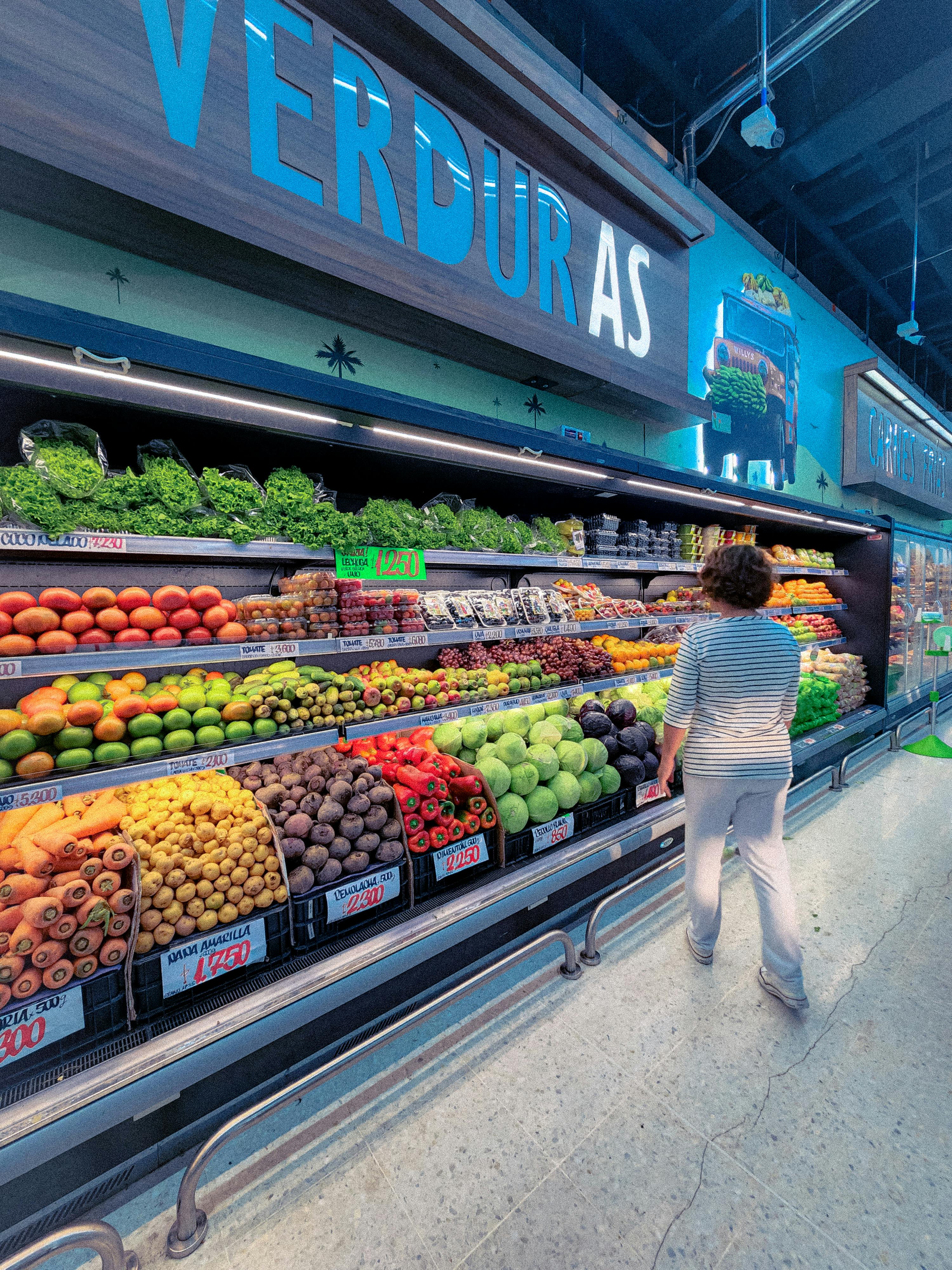
Walk into a supermarket and your route is often being decided for you. The difference is that American stores usually make that strategy far more aggressive than Canadian ones.
The layout trick hiding in plain sight

At the center of this debate is the forced-path layout, a design choice that gently, and sometimes not so gently, steers customers through large parts of the store before they can reach everyday basics. In many U.S. supermarkets, essentials such as milk, eggs, and bread are deliberately placed deep in the back. That placement increases exposure to higher-margin categories like snacks, seasonal goods, prepared foods, and premium beverages.
Retail consultants have explained this tactic for years because it works on a simple principle: more exposure tends to mean more impulse buying. NielsenIQ and trade analysts have repeatedly noted that unplanned purchases account for a meaningful share of grocery basket growth. When a shopper enters for one item and passes twenty tempting displays, average transaction value often rises.
The trick is not just about where products sit. It also depends on aisle width, end-cap displays, sightlines, music, lighting, and the way produce is staged at the entrance to signal freshness. American operators have refined this into a science, creating a shopping journey that feels natural even when it is highly engineered.
Why American grocers lean into it
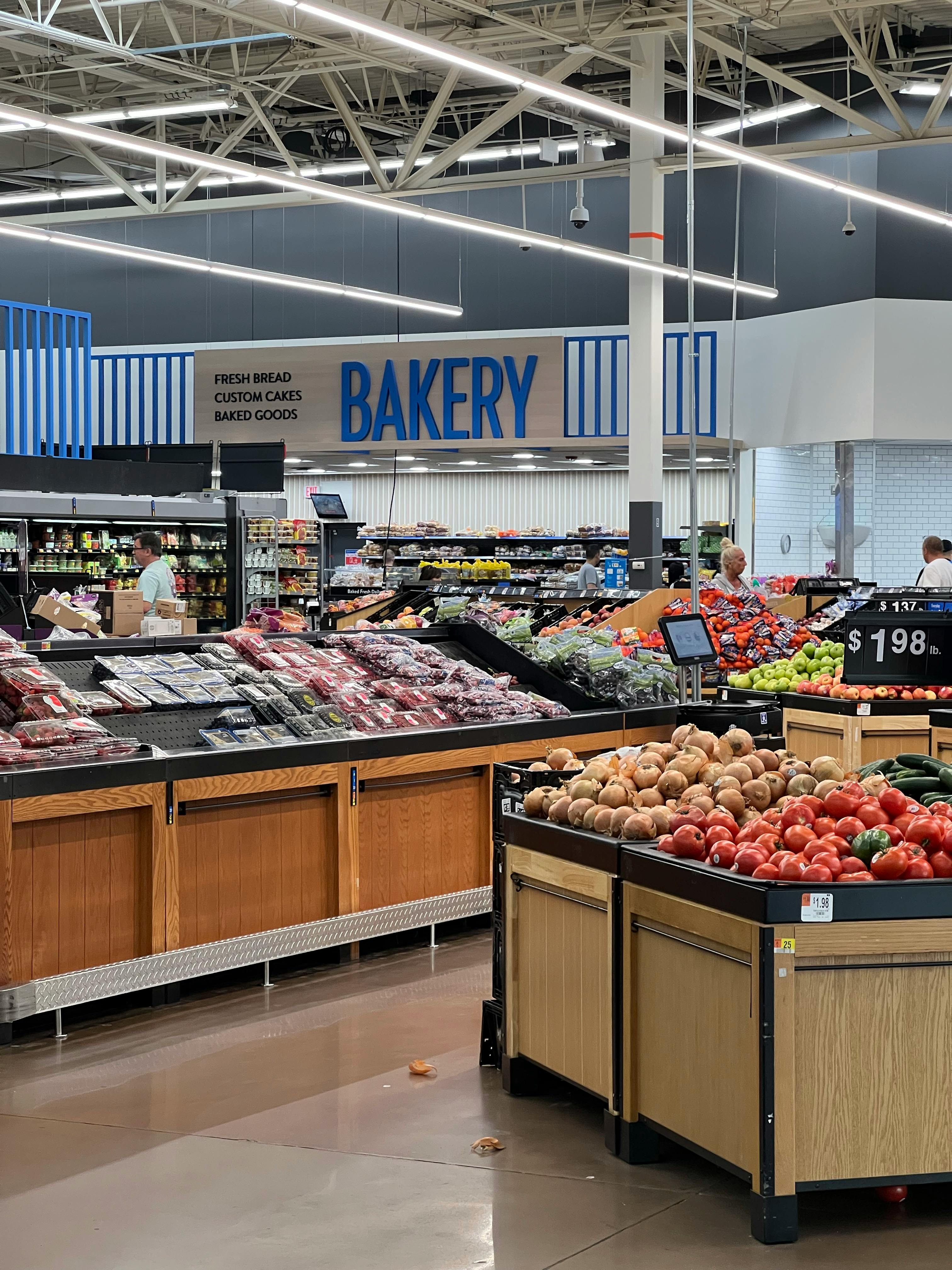
The U.S. grocery market is brutally competitive and unusually promotional. Chains fight for share not only against each other, but also against warehouse clubs, dollar stores, drugstores, convenience chains, and e-commerce players. In that environment, every additional item in the basket matters, and store layout becomes a direct profit tool.
Margins in grocery are notoriously thin, often hovering in the low single digits. That is why high-margin departments such as bakery, deli, floral, grab-and-go meals, and private-label snacks get prime positions along customer traffic paths. The longer shoppers stay in-store, the more likely they are to buy from those profitable categories instead of sticking to a strict list.
U.S. stores also tend to be physically larger on average, especially in suburban markets. More square footage makes the guided journey easier to implement. A sprawling floor plan naturally creates room for decompression zones, promotional islands, cross-merchandising displays, and long routes that reward browsing.
Why Canada has been slower to copy it

Canada is not free of retail psychology, but many chains have historically taken a more practical approach. Canadian grocery footprints are often smaller, especially in dense urban areas where real estate costs are high and shoppers may arrive on foot or by transit. In those environments, convenience is not just a branding choice. It is an operational necessity.
There is also a different consumer expectation at work. Canadian shoppers, facing higher food prices in many categories and less retail density outside major metros, often place a premium on efficiency. A store that feels intentionally obstructive can create irritation faster than excitement, particularly when customers are making frequent fill-in trips instead of large weekly stock-up visits.
Another factor is market concentration. Canada's grocery sector is dominated by a handful of major players, and that can reduce the pressure to mimic every high-conversion American tactic immediately. Instead, chains have often prioritized dependable navigation, familiar departments, and quicker staple access over a more theatrical selling path.
What Canadian stores do instead
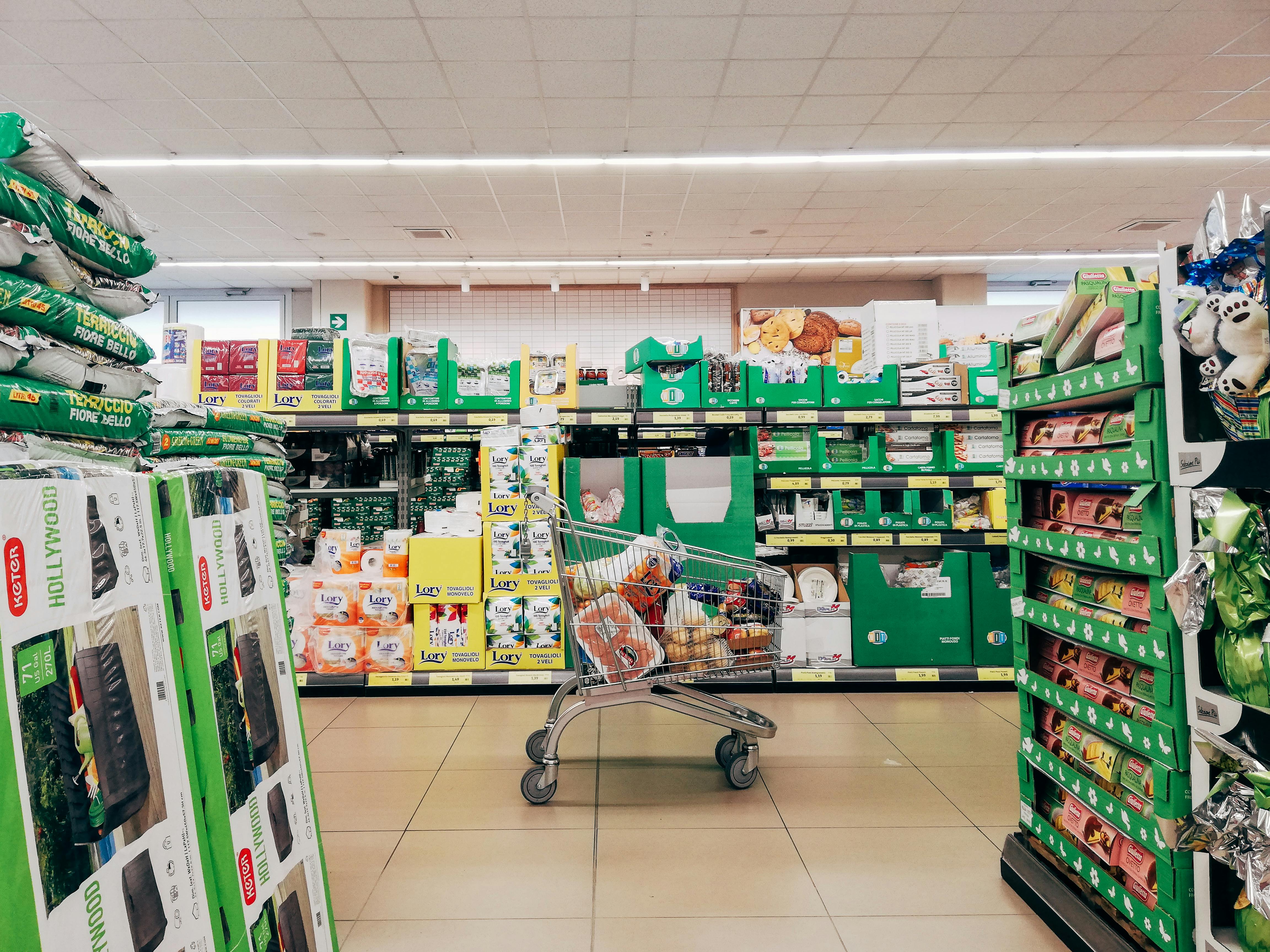
Rather than forcing one long journey, many Canadian supermarkets use a softened version of the same psychology. Produce still greets shoppers near the entrance because color and freshness improve perception. End caps still push promotions. Seasonal displays still capture attention. But the path to staple goods is often less circuitous than in a classic U.S. superstore.
Discount banners in Canada have been especially influential in shaping this style. Chains such as No Frills, FreshCo, and Food Basics emphasize value, speed, and predictability over ambiance. Their layouts are usually clearer, fixtures more functional, and product adjacencies more straightforward, which supports shoppers who are highly price sensitive and mission driven.
Even premium Canadian formats often balance inspiration with access. Stores may place prepared foods and specialty sections near the front, but they usually avoid making the customer feel trapped in a maze. The design goal is still to sell more, just with less friction.
The business case behind both approaches
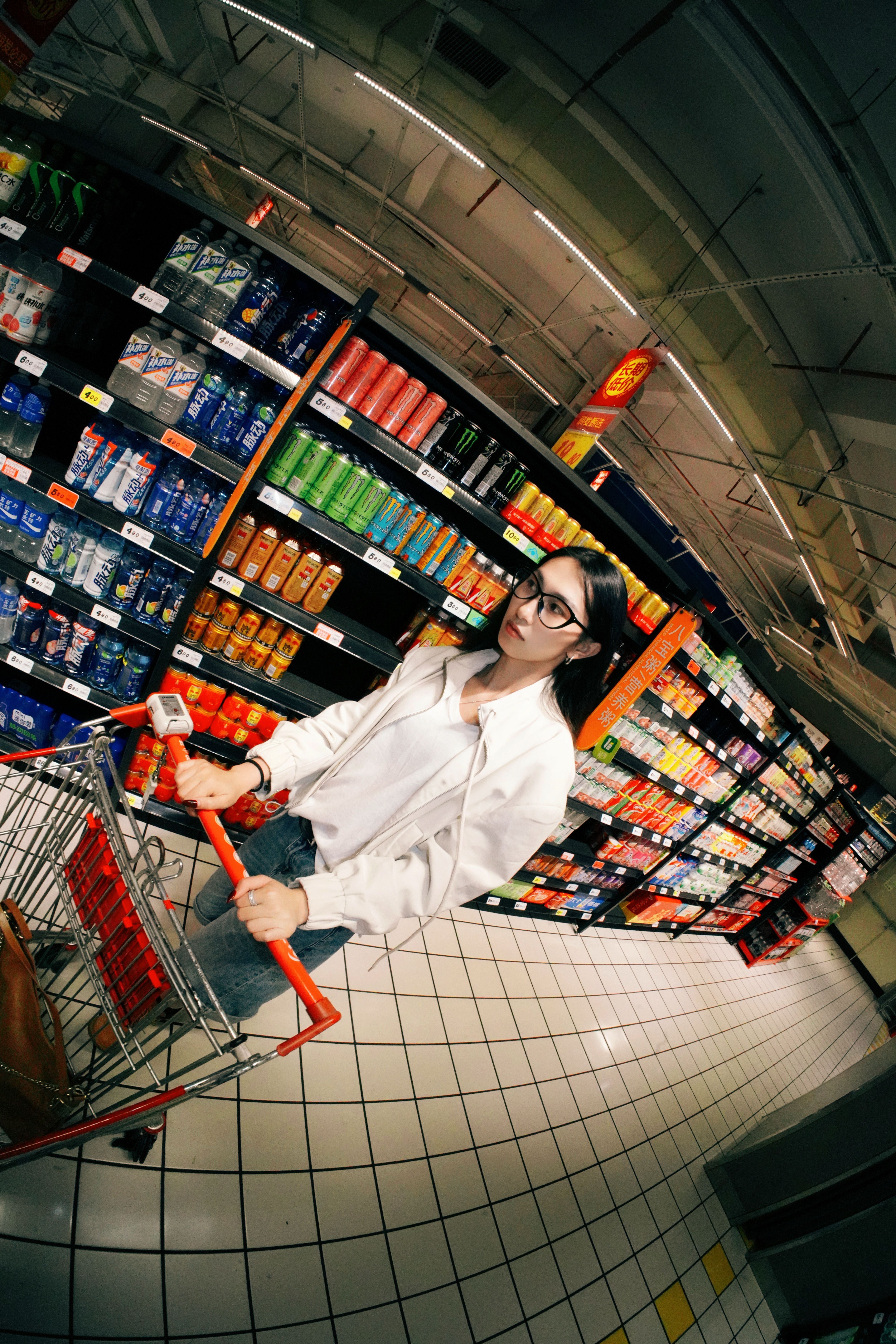
American chains are not irrational for using the forced-path model. It can lift dwell time, improve category discovery, and help justify large-store economics. For a suburban household doing one major weekly trip, a browse-heavy layout can feel normal, even enjoyable, especially when paired with meal solutions and strong promotions.
Canadian resistance is not irrational either. Higher urban concentration, smaller homes, and more frequent grocery trips can make efficiency a stronger selling point. If a shopper pops in for produce, dairy, and one dinner item, a long detour may feel like a tax on time rather than an invitation to explore.
Behavioral economics helps explain the split. When consumers feel in control, they often remain receptive to suggestion. When they feel manipulated, they rush, buy less, or switch stores. The best retailers understand that layout is not just about traffic flow. It is about trust.
Will Canada eventually adopt the U.S. model?
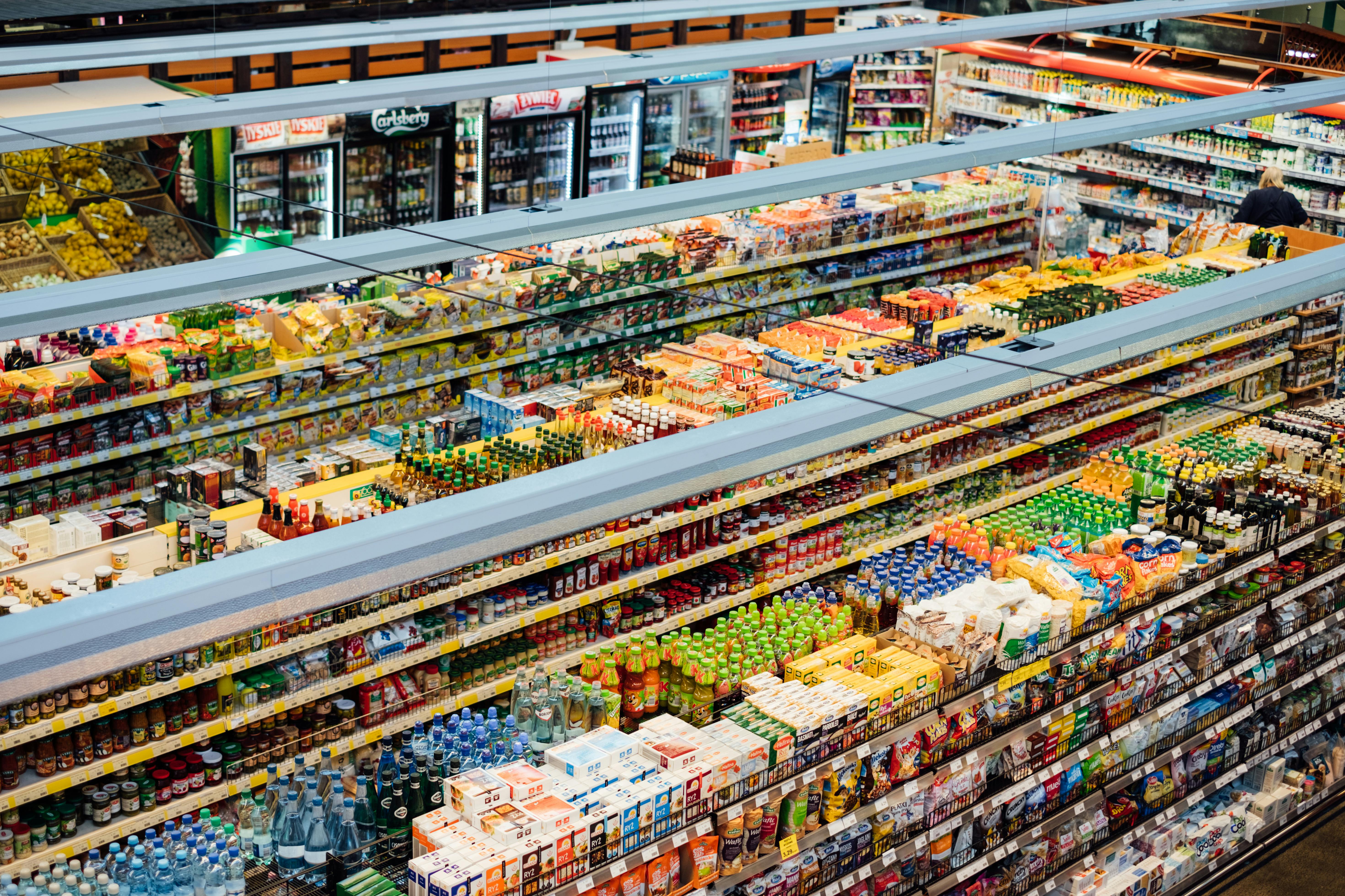
Some convergence is already happening. As food retailers face inflation pressure, labor costs, and competition from online ordering, they are experimenting with more strategic traffic patterns. Renovated stores increasingly feature destination prepared foods, expanded private label displays, and more deliberate cross-merchandising, all borrowed in part from American playbooks.
Still, Canada is unlikely to copy the U.S. formula wholesale. The country's geography, shopping habits, and concentration of grocery ownership encourage a different balance between persuasion and practicality. Even when Canadian chains modernize, they tend to preserve clearer routes to staples and a less theatrical customer journey.
So the real difference is not that one country understands grocery psychology and the other does not. It is that America often pushes the layout trick harder, while Canada generally applies it with a lighter hand and greater respect for speed.



Leave a Reply