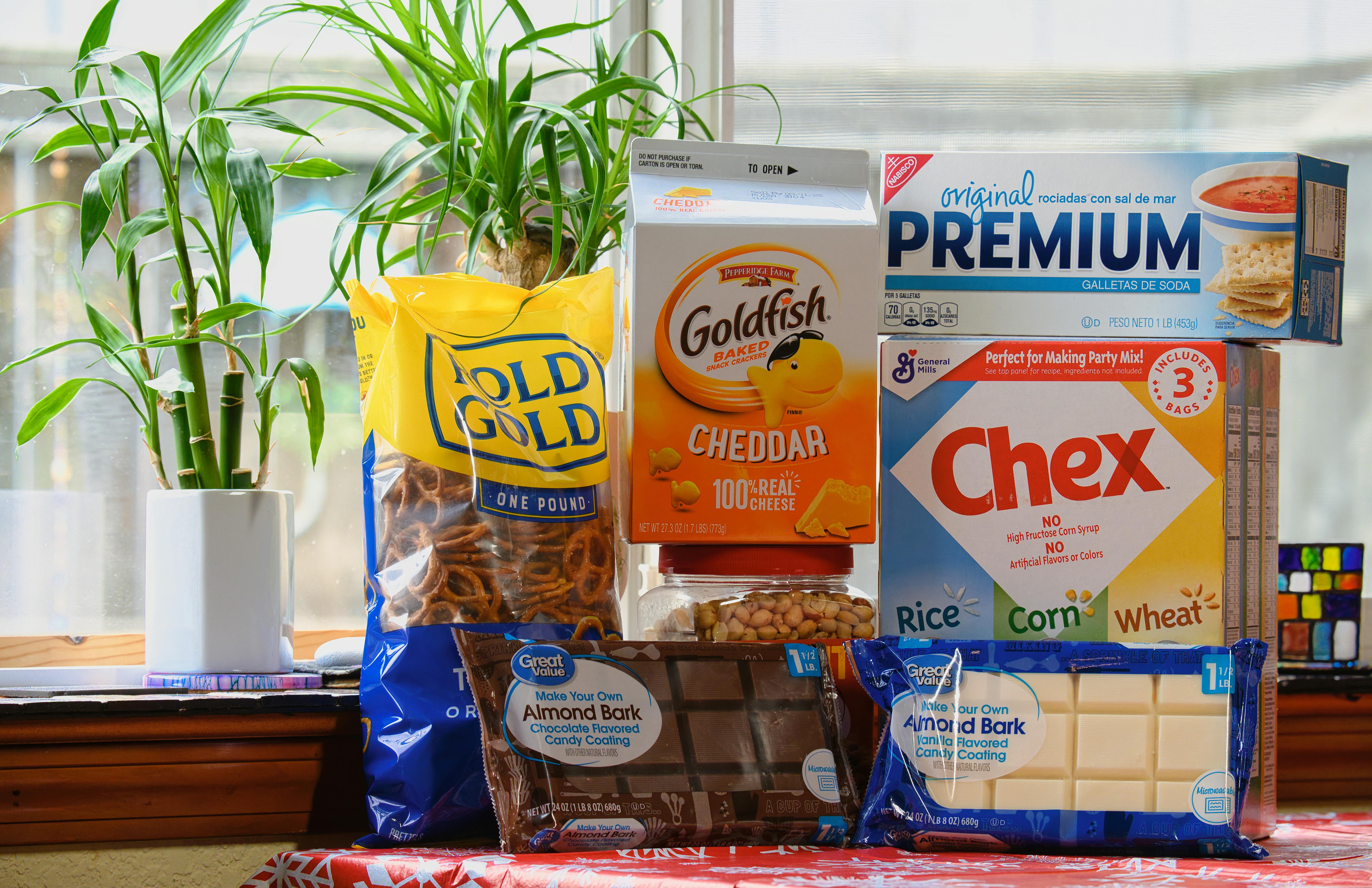
That bag of chips looks generous. The juice bottle feels hefty. The family-size cereal box seems like a smart deal. But in many grocery aisles, packaging is carefully designed to shape your perception before you ever check the net weight or serving count. This gallery breaks down the subtle tricks brands use to make products appear more abundant, and shows what to look for if you want the real value.
Oversized boxes with extra empty space

A big box sends a simple message to your brain: more product. That reaction is exactly why some cereals, crackers, snack bars, and frozen foods come in packages that look full-sized on the shelf but hold far less than their dimensions suggest.
This effect is often tied to what consumer advocates call slack fill, the empty space inside a package. Some empty room can be necessary to protect contents during shipping, but packaging can also be designed so the outer box feels more substantial than the actual quantity inside. If you want the clearest comparison, skip the front panel and check net weight, serving count, and how full the inner bag really is.
Tall, narrow containers that seem bigger
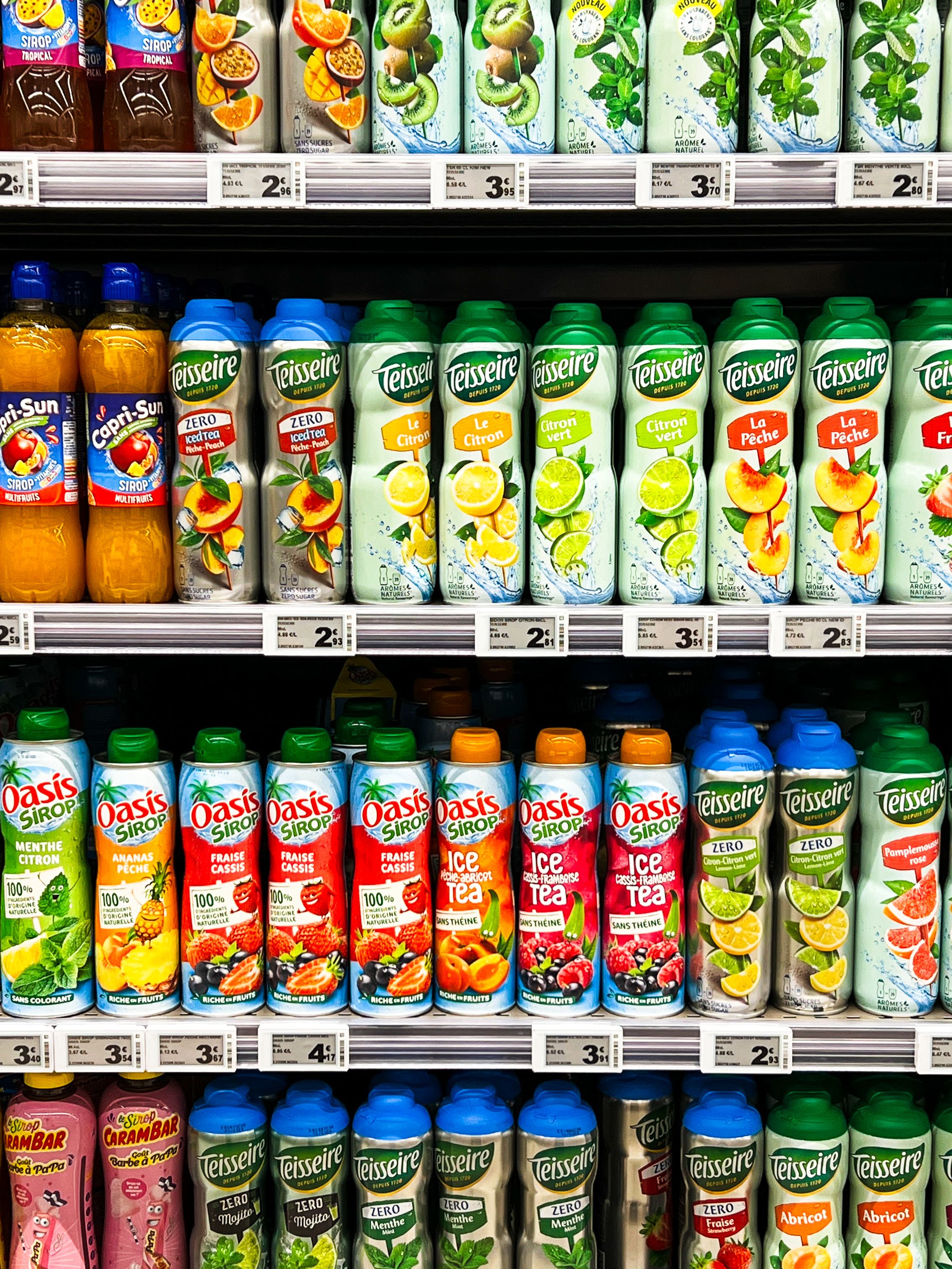
Shape changes perception faster than most shoppers realize. A tall bottle, slim carton, or stretched yogurt cup can look like it holds more simply because people tend to read height as volume, even when the total amount is ordinary.
Designers know vertical packaging stands out on a shelf and feels generous in the hand. The trick works especially well with beverages, sauces, nuts, and pantry staples sold in clear or semi-clear containers. Two packages can contain nearly the same amount, yet the taller one often looks like the better buy at a glance. A quick look at ounces, fluid ounces, or grams usually tells a different story than the silhouette does.
Indented bottoms and thick container walls
Sometimes the illusion is built right into the structure. Jars, tubs, and bottles can be molded with thick bases, deep indentations, or bulky walls that make the package feel sturdy and premium while quietly reducing the amount of usable space inside.
This is common in products where heft signals value, such as dips, spreads, cosmetics-style food packaging, sauces, and drinks in rigid plastic. From the outside, the container reads as substantial. Inside, the cavity that actually holds the product is smaller than you might expect. Transparent packaging can soften the trick, but not always, especially when labels cover the lower portion. Weight and volume markings are the only reliable way to know what you are truly getting.
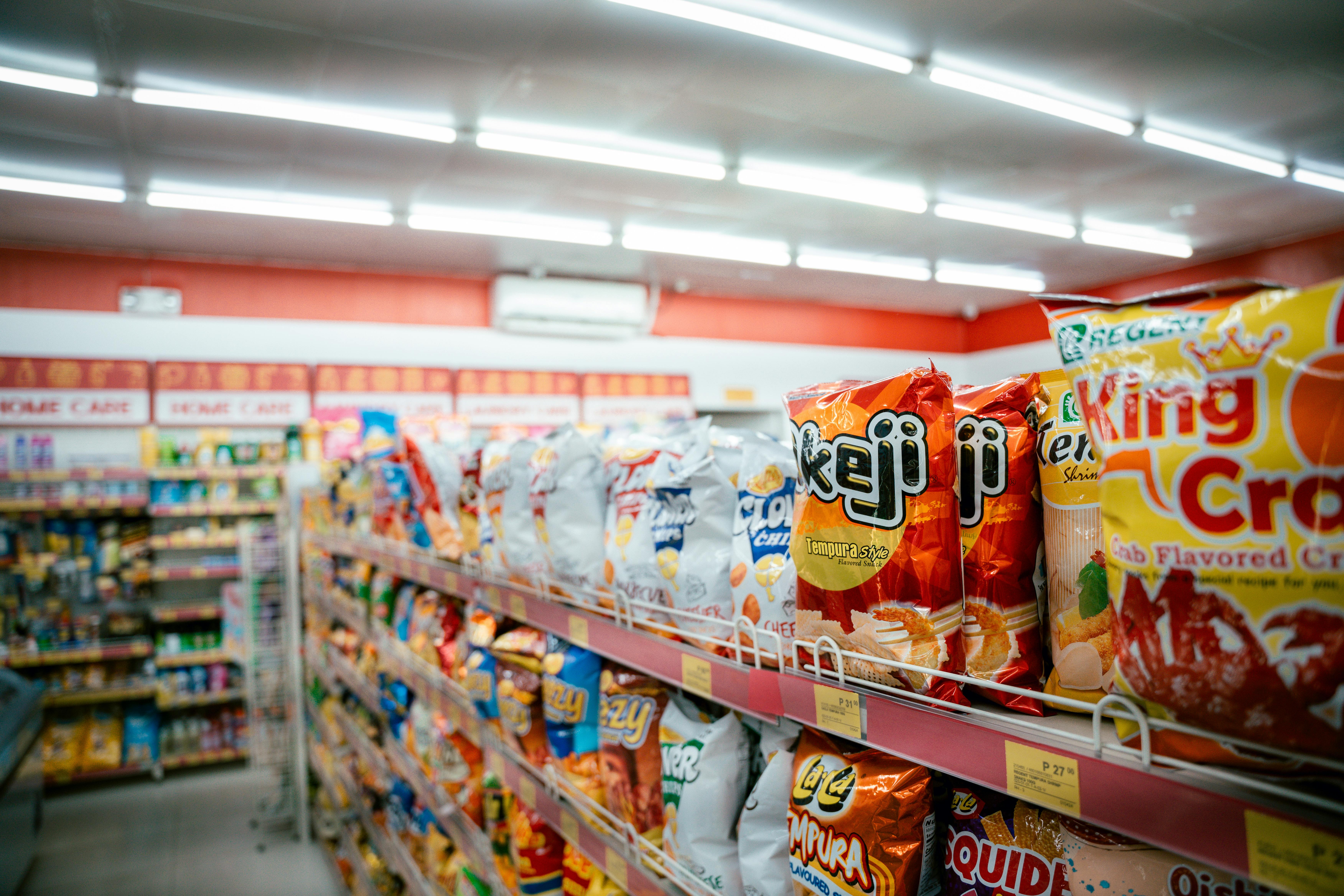
Bags puffed up with air

A full-looking bag can create instant confidence. With chips, popcorn, salad mixes, and frozen produce, that visual cue matters because shoppers often judge quantity before they read anything else.
Some air inside a bag is functional. In snack foods, for example, the gas helps cushion delicate contents and can preserve freshness. But the package can still be sized to look more abundant than the amount inside really is. A large bag with a modest fill level feels like a letdown once opened, even if the stated weight is accurate. The front of the bag sells abundance. The ounces near the bottom edge tell the more honest story.
Wide openings that reveal only the top layer
What you see first often becomes what you believe is throughout the package. Some food containers are designed so the visible top layer looks especially plentiful or high quality, while the rest of the contents may be less impressive once you dig in.
Think bakery boxes with a picture-perfect top row, nut mixes where premium pieces sit near the window, or frozen foods arranged to showcase the largest items first. Clear lids and peek-through windows can be helpful, but they can also frame only the most attractive portion. This is less about outright deception and more about controlled presentation. The lesson is simple: a curated view is still a limited view, not a guarantee of what fills the whole package.
Family-size labels that do not add much more
The words family size, party size, and value size carry a strong promise: more for your money. But larger labels do not always mean a meaningfully larger amount, and they certainly do not guarantee a better unit price.
Brands use size language because it suggests savings and abundance before you compare the numbers. Sometimes the bigger package contains only a modest increase over the regular version, yet takes up far more shelf space and visual attention. In other cases, the cost per ounce is barely lower, or even higher. This is where shelf tags with unit pricing become useful. The bold claim on the front is marketing. The cents-per-ounce figure is the part that actually answers the question.
Serving sizes that make the package seem fuller

Numbers can flatter a package just as much as graphics can. One common tactic is using serving sizes that make the product seem more plentiful, either by breaking a package into many small servings or by framing a small amount as satisfying enough for one person.
A frozen meal, carton of soup, or bag of granola may appear to offer several portions, which can make the package feel like a better value. In reality, many people eat more than the listed serving in one sitting. That means the product runs out faster than expected and the apparent abundance disappears. Serving information is legally important, but it is also a perception tool. For practical shopping, compare total weight and ask yourself how much your household will actually consume.
Resized packages that look familiar but hold less
Perhaps the most effective trick is the one you barely notice. A package can be redesigned to look almost identical to the old version while quietly containing fewer ounces, fewer slices, or fewer pieces. Because the branding feels familiar, many shoppers assume the quantity is unchanged.
This tactic often appears during periods of rising production costs, when brands shrink the contents instead of sharply raising the sticker price. The package may become slightly narrower, the depth may change, or the count inside may drop by just enough to escape notice. This is the classic shrinkflation move. It works because people shop by memory and habit. Unless you compare net weight and unit price over time, the smaller amount can pass as the same product you have always bought.


Leave a Reply