A trip to the grocery store can feel routine, but the layout around you is rarely accidental. From produce pyramids to tempting end caps, many displays are designed to slow you down, catch your eye, and increase impulse buys. Here's how 12 common grocery store setups in Canada work on your shopping habits, often without you noticing.
Produce Displays at the Entrance

First impressions matter, and supermarkets know it. That's why fresh fruit and vegetables often greet shoppers right at the door, creating a colourful, wholesome mood before the real spending begins.
The strategy works because abundance signals freshness and value. Neat stacks of apples, bright peppers, and misted greens can make the whole store feel higher quality, which may lower resistance to spending elsewhere.
There's also a subtle psychological effect. Once shoppers feel they've made a healthy choice, they may feel more comfortable tossing in pricier snacks or prepared foods later.
End Caps That Interrupt Your Plan

An end cap is prime retail real estate. Sitting at the end of an aisle, it catches shoppers who may never walk down that section but still notice the display while passing by.
These displays often feature seasonal items, limited-time offers, or high-margin products the store wants to move quickly. Even when the price is not the lowest available, the special placement can make it feel important.
That's the key advantage. End caps create urgency and visibility, which can turn a casual glance into an unplanned purchase within seconds.
Bakery Tables Pumping Out Comfort Cues

Few displays are more effective than a bakery table loaded with warm-looking bread, cookies, or pastries. It taps into comfort, routine, and appetite all at once.
In many stores, bakery sections are designed to feel artisanal even inside large chains. Baskets, wood crates, and handwritten-style signs can make everyday items seem more special and worth a premium.
Smell plays a big role too. Fresh bread aromas can increase hunger, and hungry shoppers tend to buy more across the store, not just in the bakery department.
Prepared Food Counters Near Peak Traffic

Ready-made meals are often placed where shoppers naturally slow down, such as near produce, deli counters, or the path to checkout. The goal is simple: make convenience feel irresistible.
These displays appeal to tired parents, busy workers, and anyone shopping close to dinnertime. A rotisserie chicken, sushi tray, or pasta bake can quickly shift a shopper from planning a meal to buying one.
Because prepared foods usually carry strong margins, stores benefit when shoppers trade ingredients for convenience. The display does much of that persuasion on its own.
Cross-Merchandising That Suggests the Next Item
Sometimes the smartest display is not a big display at all. It's the chips placed beside salsa, the burger buns beside ground beef, or the whipped cream beside strawberries.
This tactic is called cross-merchandising, and it works by reducing mental effort. Instead of asking shoppers to remember what goes together, the store answers the question for them and often adds one more item to the basket.
It feels helpful because it is helpful. But it also nudges people to buy related products they may not have planned to pick up in the first place.
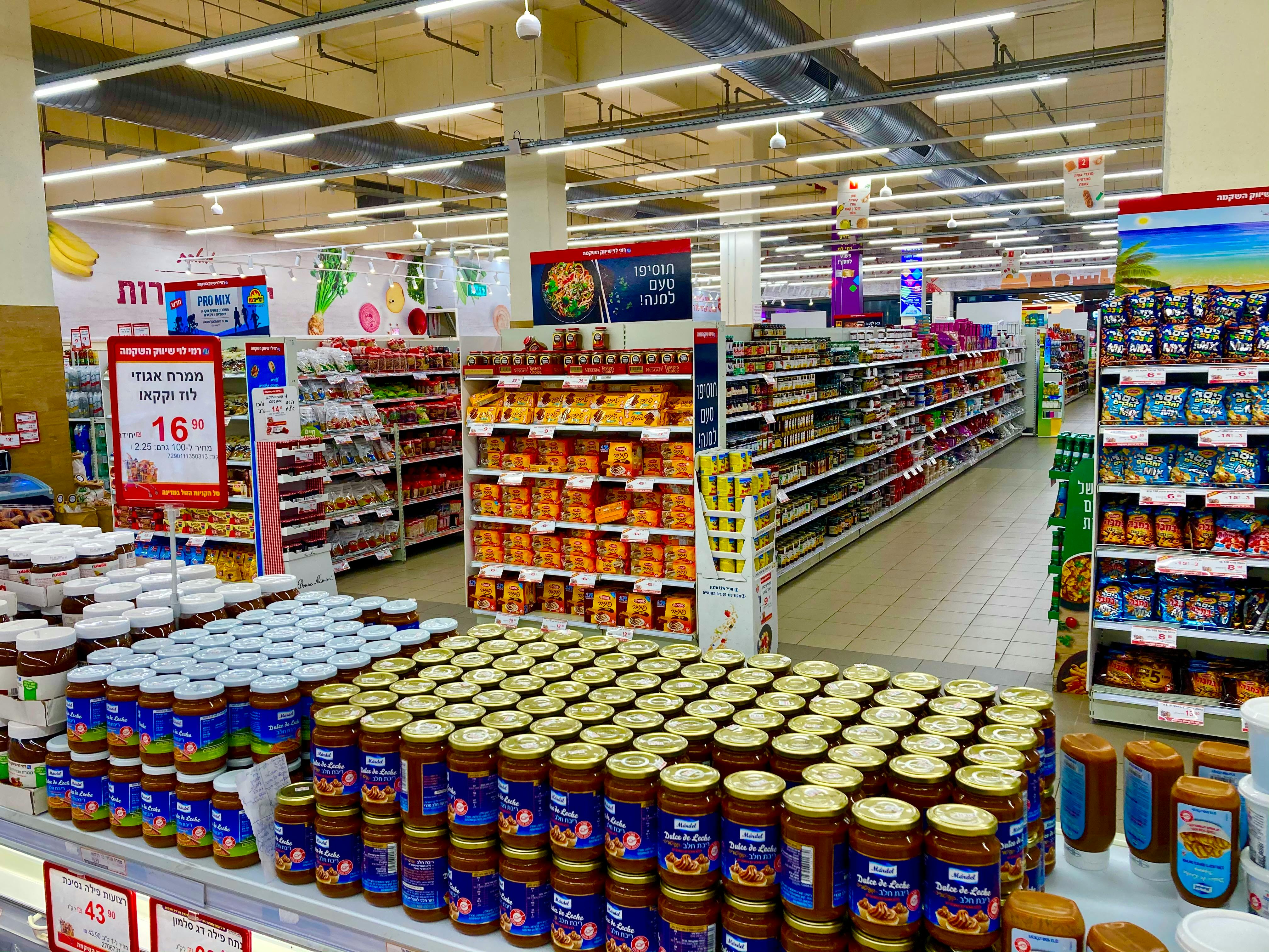
Bulk Bins That Encourage More Than You Need

Bulk sections are often framed as practical and economical, and sometimes they are. But the open-bin format also encourages shoppers to scoop a little extra without thinking too hard about the final total.
Because the price is listed by weight, not package, the cost can feel abstract in the moment. A bag of nuts, candy, granola, or dried fruit grows gradually, while spending stays easy to ignore.
The display itself adds to the appeal. Clear containers, colourful contents, and the hands-on experience can make bulk shopping feel fun, which often leads to overbuying.
Seasonal Islands in the Middle of the Store

The center of the store is often interrupted by themed displays tied to holidays, back-to-school season, or big food moments like barbecue weekends. These islands are designed to break shopping autopilot.
By grouping related products together, stores create a ready-made occasion. Suddenly maple-flavoured treats, grilling sauces, paper plates, and coolers feel less like random goods and more like part of a plan.
That framing matters. People often spend more when a display helps them picture an event, not just a single product on a shelf.
Eye-Level Shelves With Premium Products

Where an item sits on the shelf can influence what sells. Eye-level space is usually reserved for brands that are more profitable, heavily promoted, or more likely to convert a quick decision.
Shoppers often scan straight ahead first, especially in crowded aisles. That gives premium cereals, snacks, sauces, and pantry staples a clear advantage over cheaper alternatives placed higher or lower.
Children's products follow a similar rule. Sugary snacks and brightly packaged cereals are often positioned at a child's eye level, where they can spark requests before parents compare prices.
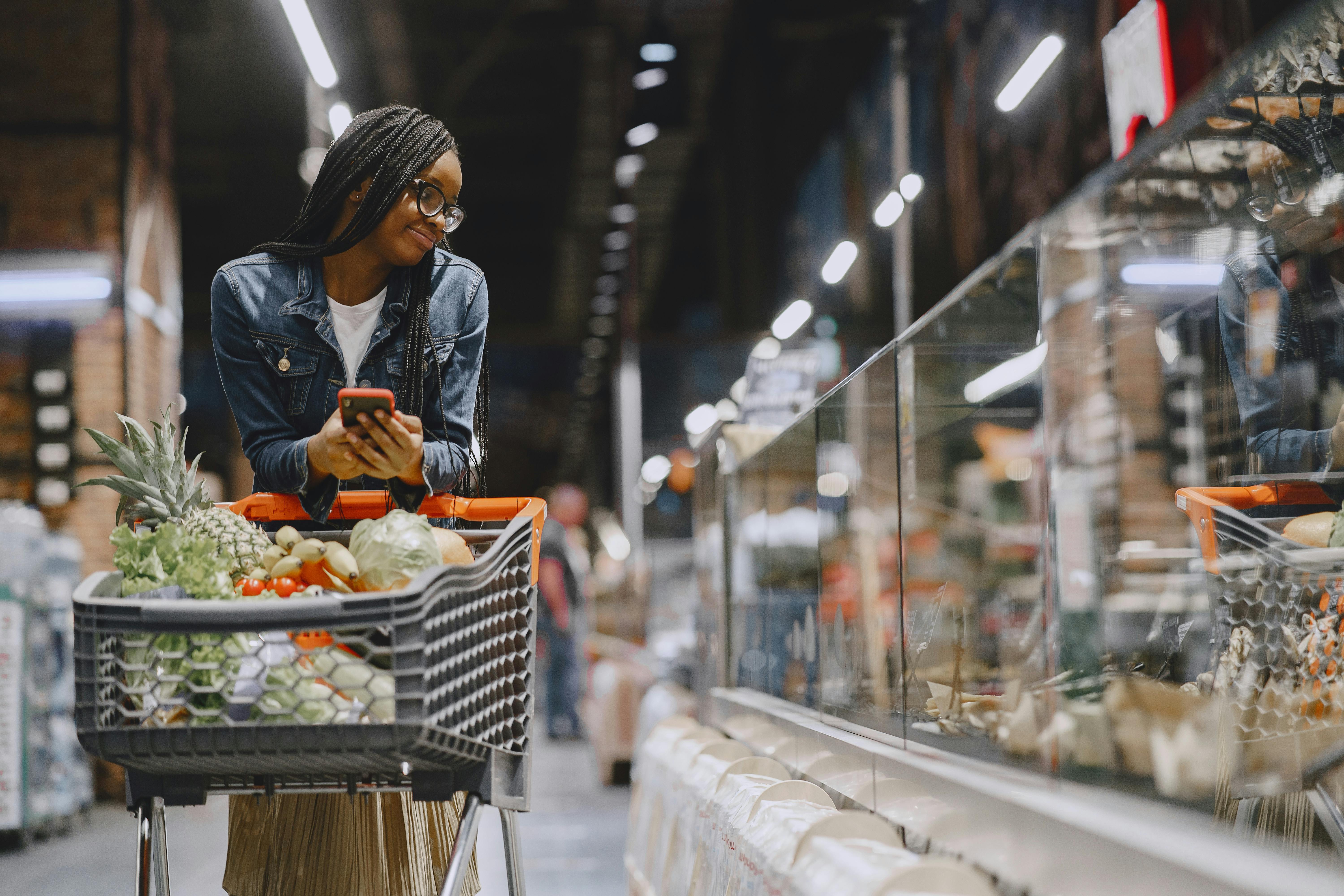
Refrigerated Grab-and-Go Cases by the Front

Cold cases near the entrance or checkout corridor are built for speed. Bottled drinks, cut fruit, yogurt, sandwiches, and snack packs are placed where shoppers can add them with almost no friction.
These displays do especially well with people shopping for just a few items. A quick trip for milk can easily turn into milk plus a drink, a salad, and a dessert because the products feel immediate and practical.
Convenience is the selling point, but placement is the engine. The easier something is to grab, the more likely it is to land in a basket.
Checkout Lanes Packed With Small Temptations
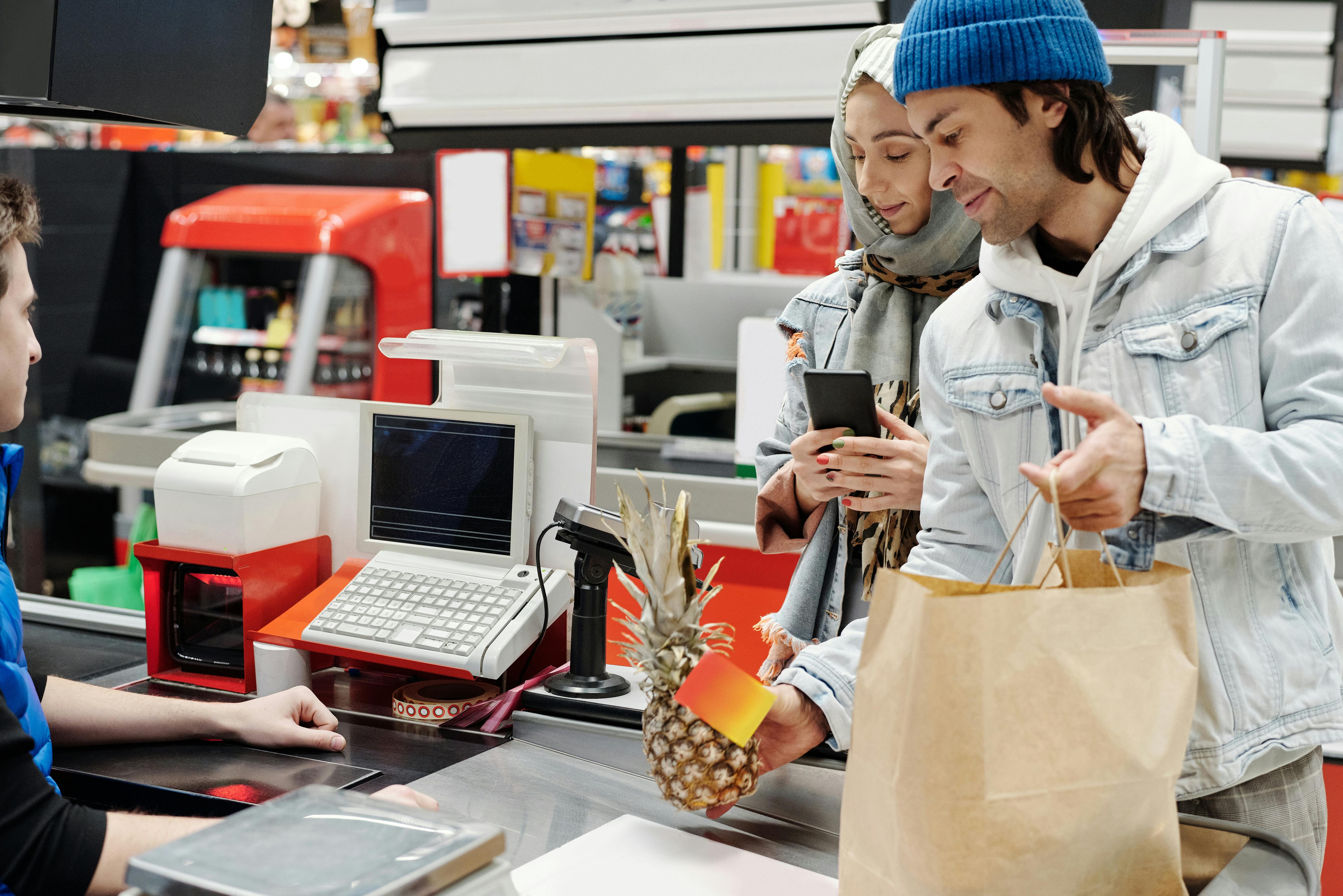
The checkout lane is one of the oldest selling tricks in retail, and it still works remarkably well. Candy, gum, magazines, lip balm, and mini snacks are chosen because they are cheap, visible, and easy to justify.
By the time shoppers reach the register, decision fatigue has usually set in. That makes small indulgences easier to approve, especially when the price feels minor compared with the full cart total.
For families, the effect can be even stronger. Items placed within a child's reach can create last-minute requests that many tired adults simply accept.
Large Cart Displays That Make Purchases Look Small
Not every spending cue is a shelf. Sometimes it's the cart itself. Larger shopping carts can make a normal amount of groceries look modest, which may encourage shoppers to keep adding items.
Stores also use wide display zones around cart-heavy areas, such as warehouse-style stacks of beverages, paper goods, or club-size packs. Big quantities can imply savings, even when the unit price is not especially low.
The visual message is simple and effective. When products look manageable in the cart, shoppers may feel they have bought less than they actually have.
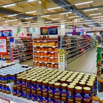
Limited-Time Signs and Member Price Displays
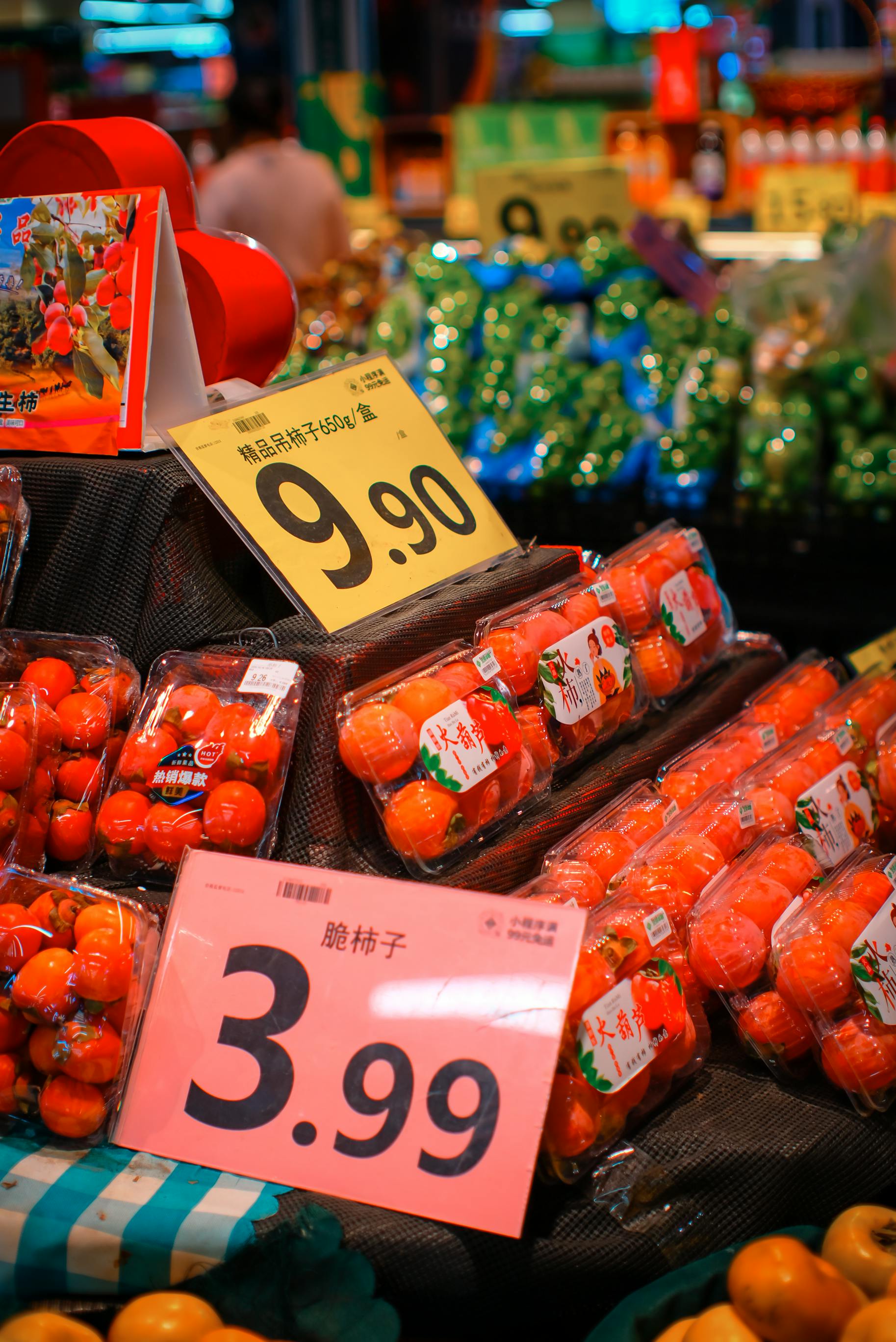
A simple sign can do a lot of work. Phrases like limited time, member price, weekly special, or while quantities last can add urgency even when the actual discount is modest.
These displays are common in Canadian grocery stores that use loyalty programs or digital offers. The signage suggests a narrow window to save, pushing shoppers to buy now rather than compare carefully or wait.
That pressure can lead to extra spending, especially on products shoppers had not planned to buy. The fear of missing a deal often feels stronger than the satisfaction of sticking to a list.

Leave a Reply