
Food labels are supposed to make shopping easier. In Canada, many of the newest packaging changes are doing the opposite.
Front-of-package symbols look simple, but they hide context
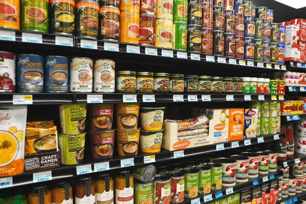
At first glance, warning symbols on packaged foods seem like a major win for consumers. Health Canada's newer front-of-package rules are meant to flag foods high in saturated fat, sugars, or sodium. That sounds straightforward, and in many cases it is.
The confusion starts when shoppers assume the symbol tells the whole story. A product may carry a warning for sodium while still being high in protein, fibre, or other useful nutrients. Another product may avoid the symbol because of technical exemptions, not because it is meaningfully healthier.
This creates a shortcut effect in the aisle. People scan the front, make a quick judgment, and move on. Nutrition experts have long warned that front labels work best as alerts, not final verdicts, yet packaging design encourages exactly that snap decision.
"Natural," "made with," and "source of" still blur the truth
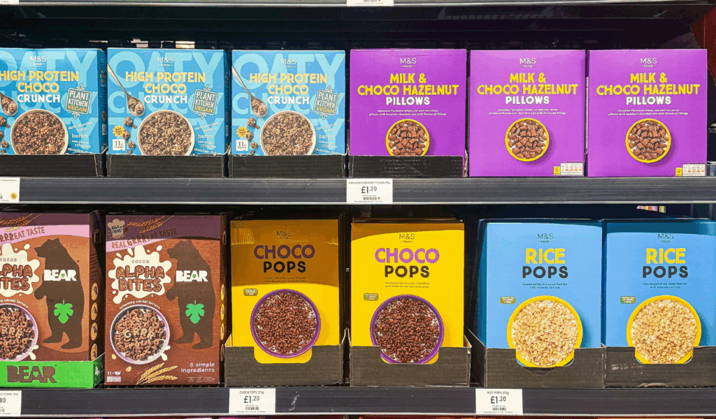
Some of the most persuasive wording on Canadian packaging is not tightly understood by shoppers. Terms like "natural flavours," "made with real fruit," or "source of whole grains" sound reassuring, but they often describe only one part of a product rather than the product overall.
A cereal can be "made with whole grains" while still relying heavily on refined grains and added sugar. A fruit snack can feature berries on the box and still contain mostly apple puree or concentrates. The claim may be technically accurate while leaving a stronger impression than the facts support.
That gap between legal wording and consumer understanding is where confusion thrives. According to consumer research in Canada and the United States, buyers routinely interpret broad positive phrases as signals of overall healthfulness, even when the Nutrition Facts table tells a more complicated story.
Shrinkflation has turned package size into a labelling problem

One of the least discussed labelling tricks is not a health claim at all. It is the quiet change in package size, count, or weight that makes a familiar item look the same while delivering less food for the same price or more.
In Canada, shoppers have reported cookies with fewer pieces, yogurt tubs with reduced grams, and snack bags that keep nearly identical branding despite downsizing. The legal net weight is still there, but it is often printed in small type that few people compare from one trip to the next.
Unit pricing can help, but it is not always consistent across stores or prominent on shelves. That leaves buyers relying on visual memory, and manufacturers know it. When shape, colour, and logo stay familiar, the reduced quantity is easy to miss.
Bilingual labels add clarity, yet wording can still mislead
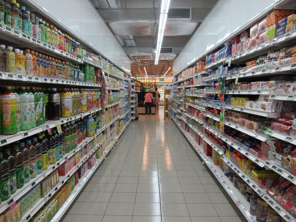
Canada's bilingual labelling system is designed to improve access and fairness. In practice, it often does. But when marketing language is layered on top of mandatory English and French information, the front of a package can become crowded, selective, and hard to decode quickly.
Brands use that space strategically. The biggest text usually promotes what sounds attractive, such as protein, immune support, or plant-based ingredients. The more limiting details, like sweeteners, sodium levels, or serving assumptions, remain elsewhere on the pack in smaller print.
Even educated shoppers can be tripped up by serving size framing. A beverage may list numbers per serving that appear moderate, while the container actually holds 2 or 2.5 servings. People think they are reading the amount for the bottle, when they are only seeing part of it.
"Product of Canada" and "Made in Canada" do not mean the same thing

Modified version: Cornischong at lb.wikipedia/Wikimedia Commons
Country-of-origin wording is another area where many consumers feel confident until they look closely. "Product of Canada" generally means nearly all major ingredients, processing, and labour are Canadian. "Made in Canada" has a lower threshold and can include significant imported ingredients.
That distinction matters more than ever as shoppers try to support domestic producers during periods of food inflation and trade uncertainty. A frozen meal assembled in Canada with imported vegetables and sauce may still sound local enough to satisfy a rushed shopper scanning the freezer case.
Packaging often leans into maple leaves, farm imagery, and regional language that reinforce the Canadian impression without making the stricter claim. The result is not always false advertising. It is often a carefully constructed feeling of local identity that exceeds what the wording guarantees.
The smartest way to shop now is slower, not just smarter
The most reliable defense against confusing labels is not perfect nutritional knowledge. It is a slower shopping habit. Looking beyond the front panel, checking serving sizes, comparing unit prices, and reading ingredient order can reveal far more than bold claims ever will.
Experts in public health and consumer behavior often make the same point: labels are tools, not verdicts. A high-protein bar may still be candy-like. A no-symbol soup may still be heavily processed. A local-looking product may be only partly Canadian.
For shoppers in Canada, the real challenge is not ignorance. It is information design that rewards speed and assumptions. The smartest buyers are being confused because packaging is built to guide attention, shape emotion, and simplify choices in ways that do not always serve the customer first.




Leave a Reply