
A dish now has to win the eye before it reaches the palate. Across Canada, restaurants are increasingly designing menus, interiors, and signature items around color because visual impact is proving to be a major driver of attention, sales, and brand identity.
Social media has changed the first bite
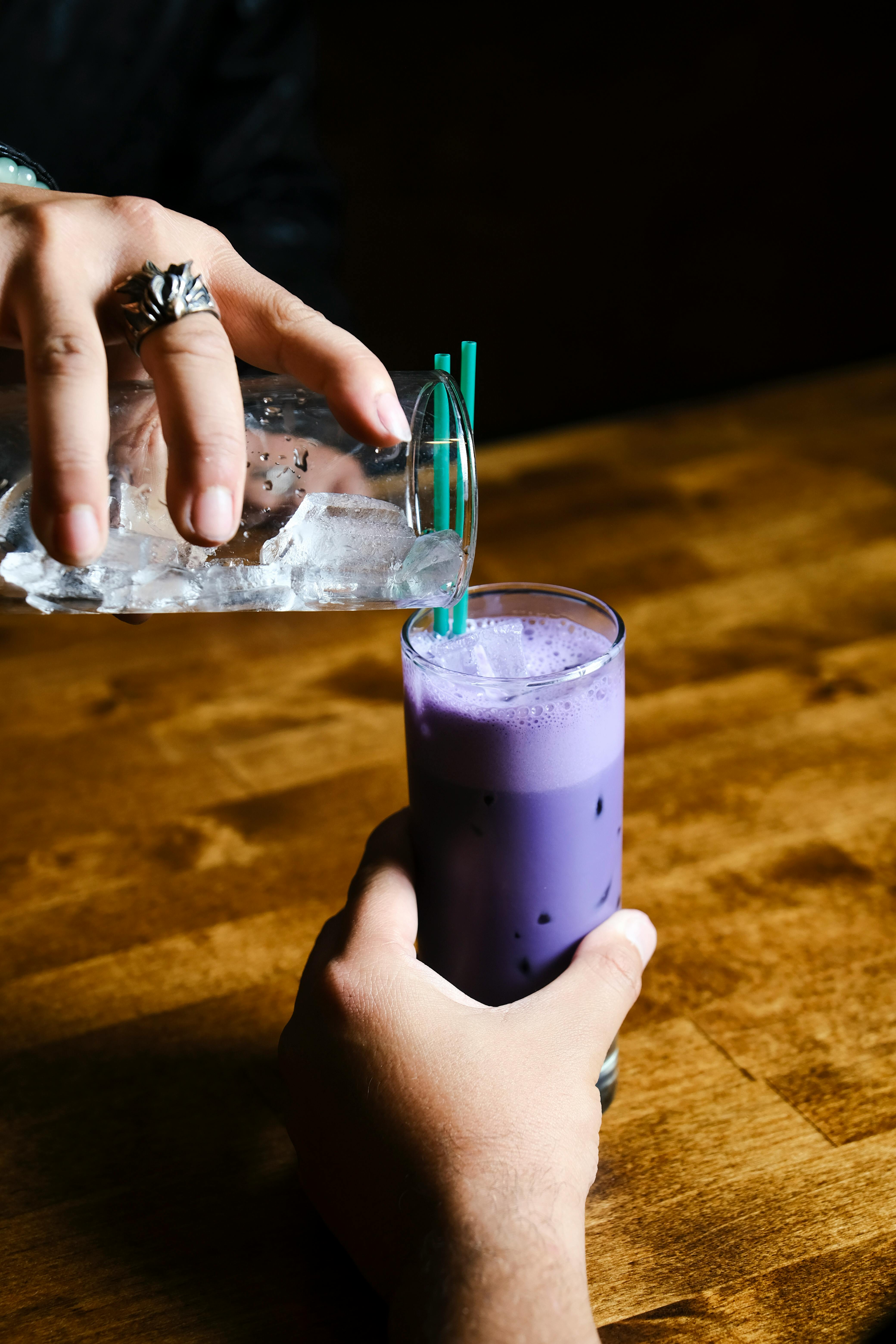
The first taste often happens on a screen. Diners in Toronto, Vancouver, and Montreal regularly encounter new dishes through short-form video and photo-heavy platforms, where a vivid ube croissant, electric matcha latte, or bright yuzu dessert can stop scrolling faster than a careful flavor description ever could.
Restaurant operators understand this clearly. A striking purple soft serve or a layered rainbow dumpling tray does not just look playful, it performs well in digital spaces where quick visual recognition matters. According to food marketing analysts, highly saturated, high-contrast food imagery tends to generate stronger engagement than neutral-toned plating.
That matters because engagement often turns directly into foot traffic. For newer restaurants with tight margins, one photogenic item can function like low-cost advertising, especially if customers post it voluntarily. In that sense, color is not replacing flavor, but it is increasingly acting as the opening sales pitch.
Color now works as a branding shortcut

In a crowded market, color gives restaurants an instant identity. Consumers may forget a business name, but they remember a bright pistachio-green pastry case, a pink mural wall, or a signature blue cocktail served in custom glassware.
This is especially useful for independent concepts trying to stand out beside chains and delivery-first brands. A restaurant built around a tight visual palette can make its menu feel coherent even before guests understand the cooking style. That consistency helps create recall across storefronts, packaging, and social content.
Canadian operators are also borrowing from retail logic. Just as consumer brands use recognizable colors to cue mood and loyalty, restaurants are using chromatic themes to signal energy, luxury, wellness, or indulgence. The result is a dining experience shaped as much by visual language as by culinary technique.
Global ingredients are bringing stronger natural hues

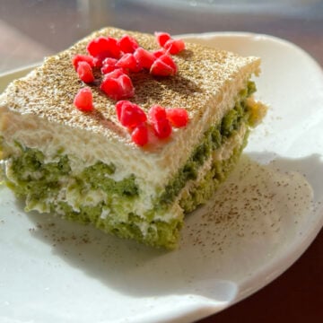
Some of the most eye-catching restaurant trends are tied to ingredients that already carry bold natural color. Ube, pandan, beet, butterfly pea flower, black sesame, turmeric, sea buckthorn, and matcha all offer immediate visual drama while also carrying recognizable flavor profiles.
Canada's diverse food culture has helped speed this up. In major cities, chefs are drawing from Filipino, Japanese, Korean, South Asian, Middle Eastern, and Latin American traditions where color has long been part of the eating experience rather than a modern marketing tactic.
That distinction matters. In many cases, the color-forward movement is not artificial styling layered on top of food. It is the visible expression of ingredients with deep cultural roots, which allows restaurants to offer something camera-friendly without making the dish feel empty or purely decorative.
Diners increasingly associate color with freshness and quality
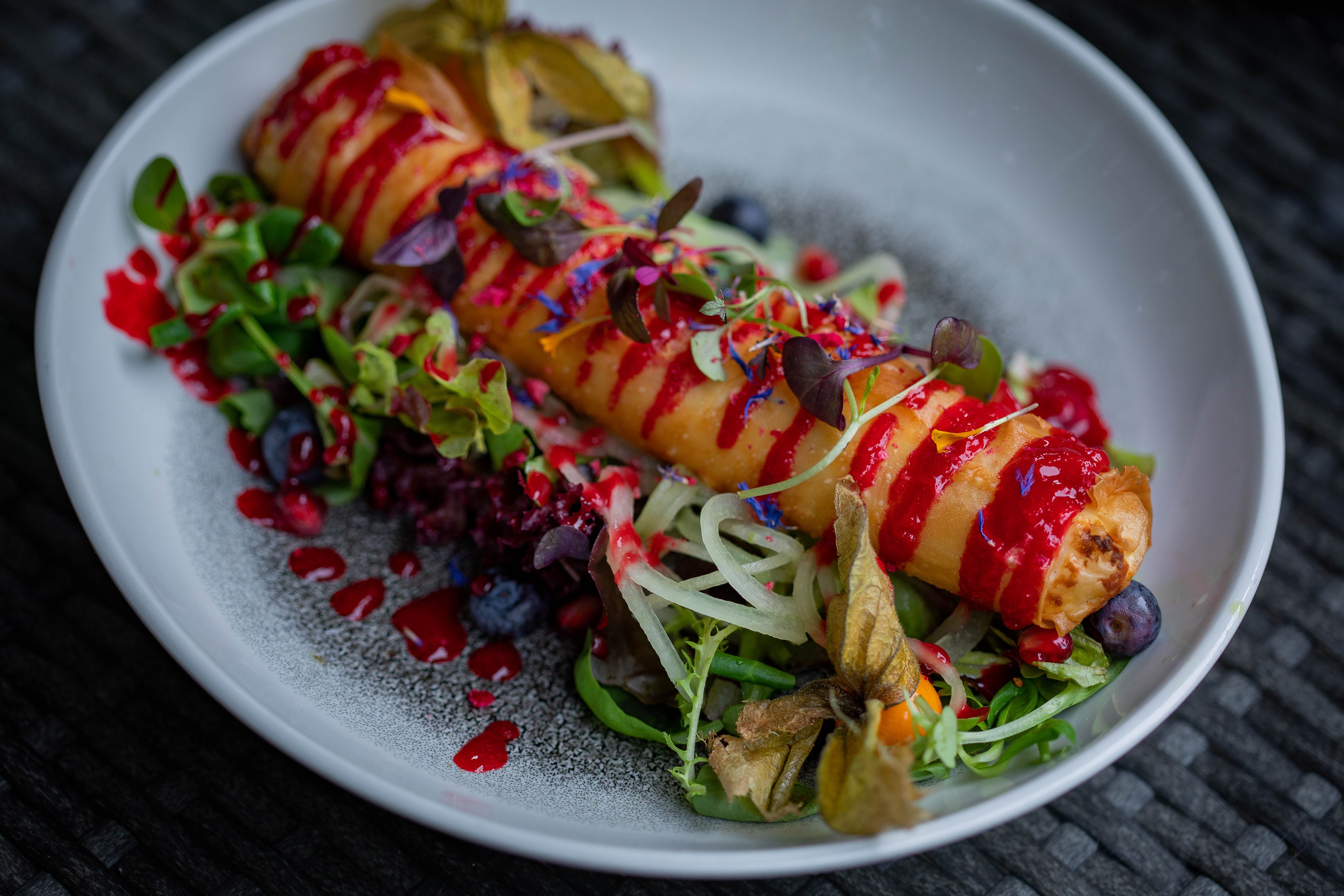
Color shapes expectations long before a meal is tasted. Research in sensory science has repeatedly shown that people use visual cues to predict sweetness, acidity, richness, and freshness, and those predictions influence satisfaction.
In restaurant settings, vibrant greens suggest herbs and freshness, deep reds imply ripeness or heat, and jewel-like citrus tones signal brightness. A salmon crudo with radish, blood orange, and herb oil can appear more flavorful before the first bite simply because its color cues align with what diners expect from freshness.
This effect can help restaurants sell lighter, produce-driven dishes at a time when many consumers want meals that feel healthier but still indulgent. If a plate looks alive and balanced, guests may perceive it as both nourishing and worth the price, even before flavor confirms it.
Economic pressure rewards dishes that market themselves
Restaurants across Canada continue to face high food costs, labor pressure, and cautious consumer spending. Under those conditions, every menu item has to work harder, and highly visual dishes often deliver stronger returns because they attract attention with less promotional spending.
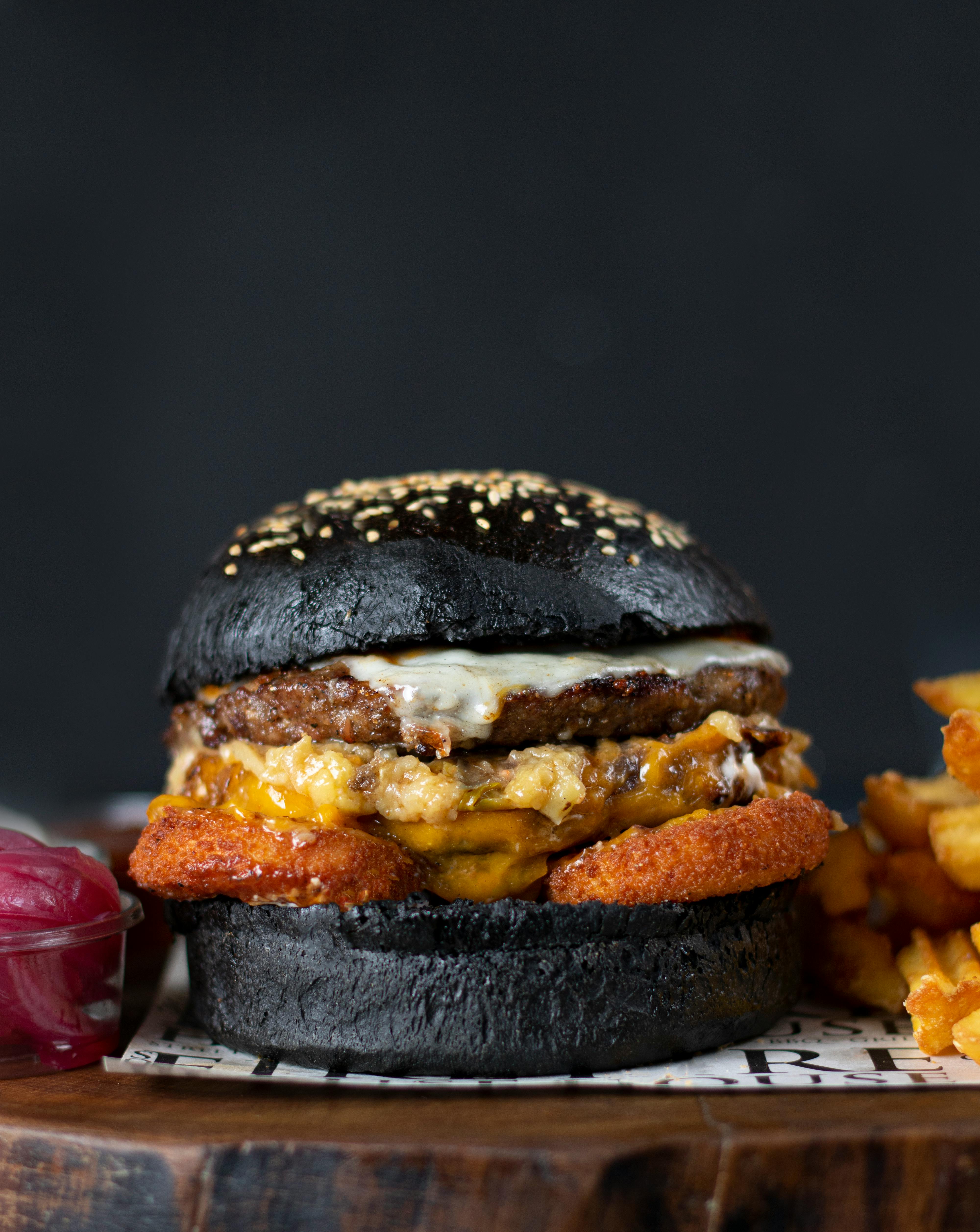
A vividly colored signature item can anchor a menu and create repeat recognition. Think of a saffron-yellow rice bowl, a charcoal-black burger bun, or a bright layered dessert that becomes the item everyone associates with the business. Even if guests order other dishes, that flagship visual draws them in.
There is also a practical advantage. If one item becomes widely shared online, restaurants can gain broad exposure without buying large ad campaigns. For newer establishments, especially in competitive urban neighborhoods, color can therefore function as a low-cost growth strategy tied directly to survival.
Flavor still decides whether the trend lasts
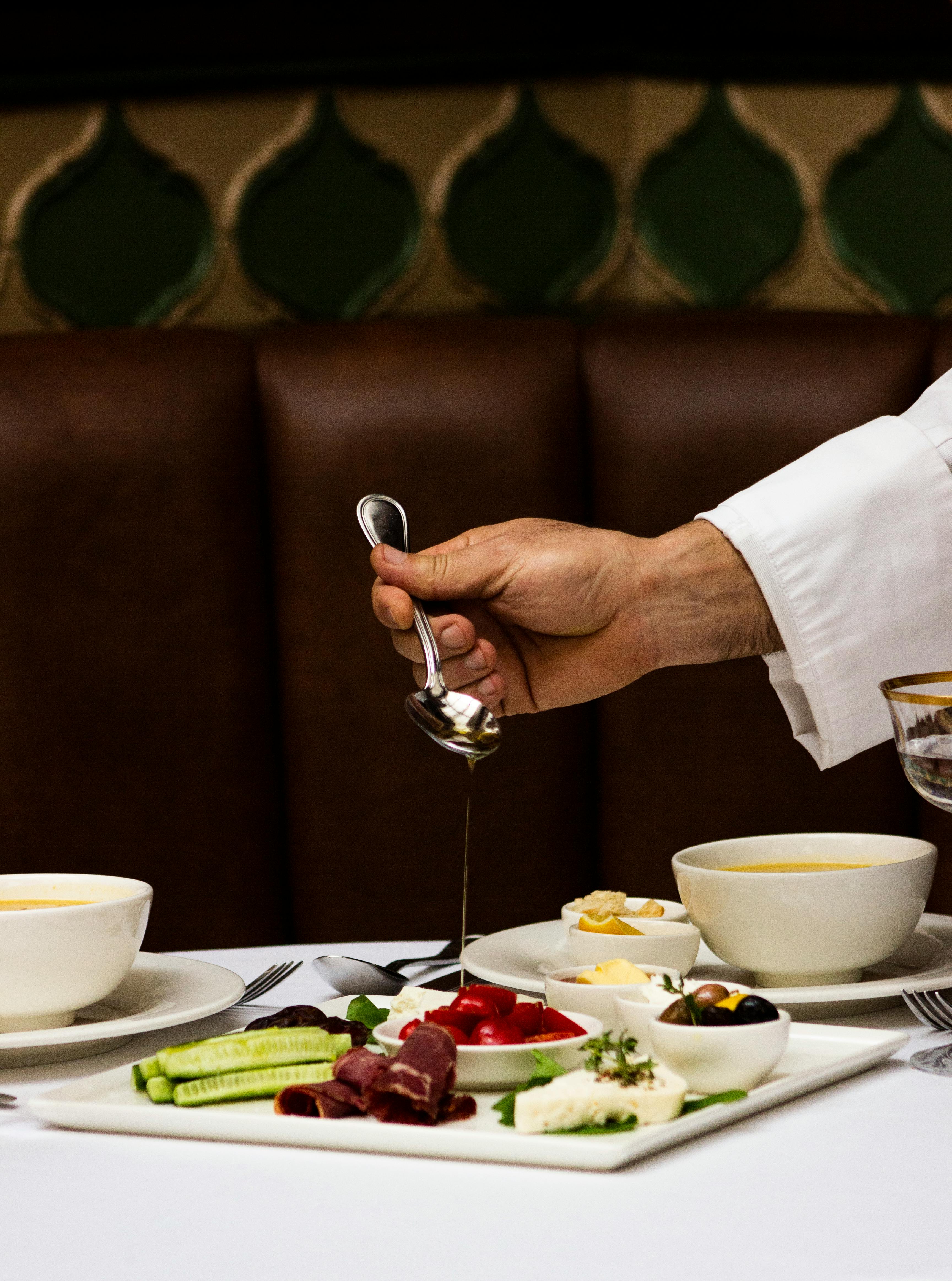
Color may open the door, but it cannot sustain loyalty on its own. Diners might visit once for a lavender-toned latte or neon glaze doughnut, yet they return only if the balance, texture, and overall execution justify the attention.
Many chefs in Canada are now trying to merge visual appeal with serious culinary credibility. That means using natural pigments, building color through technique and ingredient quality, and ensuring the look of a dish reflects the eating experience rather than overselling it.
The smartest restaurants understand that color is now part of hospitality, communication, and commerce. It creates anticipation, tells a story, and helps a dish stand out in a crowded field. But in the long run, the most successful trend is still the one where the color earns the flavor that follows.



Leave a Reply