
Shoppers in Canada and the United States often see the same snack, soup, or frozen meal wearing very different packaging. That contrast is not accidental.
Canada treats the front of the package as a public health tool
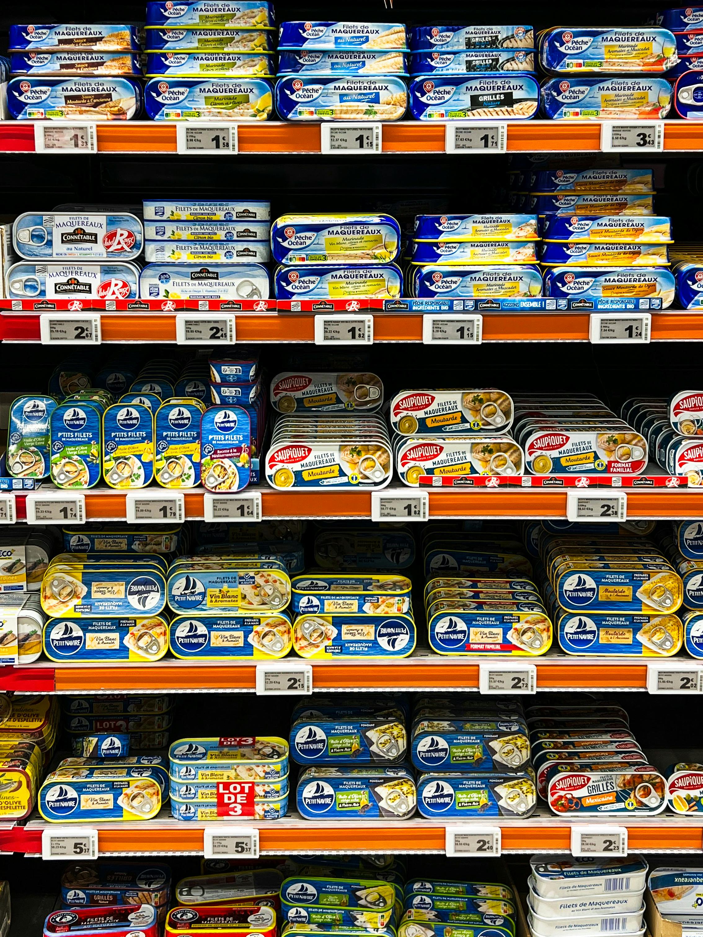
At the heart of the issue is a simple policy choice. Canada decided that many packaged foods high in sodium, sugars, or saturated fat should carry a clear symbol on the front, making that nutrition information hard to miss.
Health Canada finalized these front-of-package labeling rules after years of consultation and research. The goal was not to ban products, but to help consumers spot items linked to higher risks of heart disease, high blood pressure, and other chronic conditions in seconds, not minutes.
The black-and-white symbol is triggered when a prepackaged food meets or exceeds set thresholds for those nutrients. In practical terms, a shopper comparing breakfast cereals or canned pasta can immediately see whether a product is considered high in one or more nutrients of concern.
The U.S. relies more heavily on the Nutrition Facts panel

The American system takes a different path. In the U.S., the required Nutrition Facts label is detailed and standardized, but it usually sits on the back or side of the package rather than the front.
That means shoppers can access the data, yet they must actively look for it and interpret percentages, serving sizes, and ingredient lists. Public health experts have long argued that many people simply do not do that consistently during fast grocery decisions.
The U.S. Food and Drug Administration has explored front-of-package approaches, and nutrition researchers have pushed for simpler labeling. But unlike Canada, the federal government has not broadly mandated a prominent warning symbol for foods high in sodium, sugars, or saturated fat across the marketplace.
The symbol is about speed, clarity, and real shopping behavior

Real-life grocery shopping is rushed. People shop with kids, compare prices, scan discounts, and make split-second choices, so Canada's system is built around quick recognition rather than careful label study.
Behavioral research has shown that simple warning icons can outperform dense nutrition tables when consumers are under time pressure. A clear symbol works almost like a stop sign, signaling that the product deserves a closer look before it goes into the cart.
This approach reflects a broader shift in nutrition policy. Instead of assuming every consumer has the time and expertise to decode labels, Canada's rules acknowledge that packaging itself strongly shapes decisions and can be used to steer them toward healthier patterns.
Not every product gets the symbol, and that matters
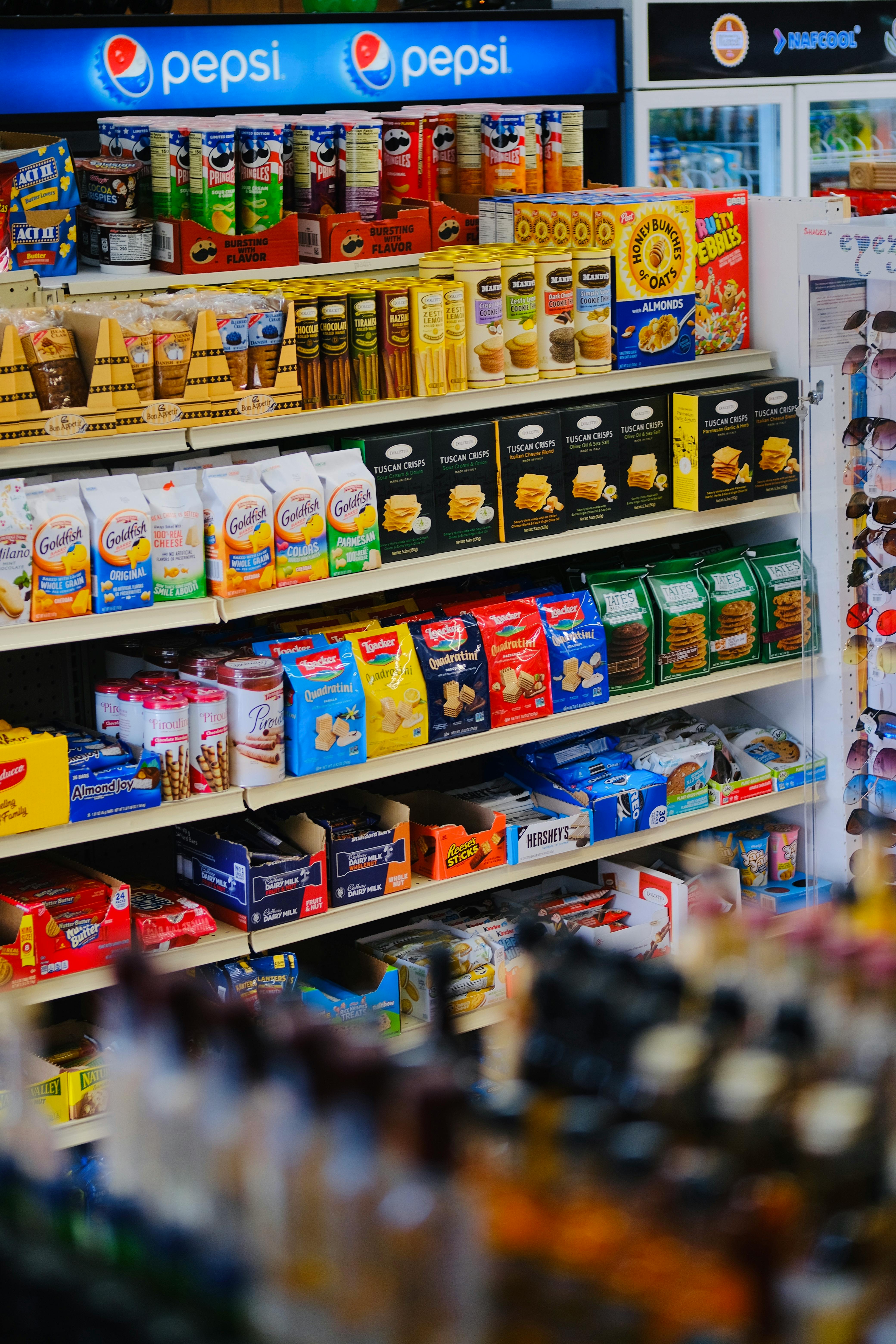
A common misconception is that Canada is slapping warning marks on everything. In reality, the rules include thresholds, exemptions, and technical criteria that determine when the symbol appears.
Some foods are exempt because of their nutritional role or packaging realities. Certain dairy products, raw single-ingredient meats, fruits, vegetables, and some foods with very small package sizes do not follow the same rules, even if they contain nutrients that would otherwise trigger concern.
This matters because the policy is targeted, not symbolic theater. It is designed to highlight categories where processed foods can quietly deliver large amounts of sodium, sugars, or saturated fat, such as soups, sauces, snack foods, desserts, and ready-to-eat meals.
The difference reflects politics, industry pressure, and regulation style

Food labeling is never just about nutrition science. It is also shaped by lobbying, trade concerns, legal risk, and different national attitudes about how aggressive government should be in guiding consumer choices.
Canada has generally been more willing in some areas to use packaging rules as a direct health measure. The U.S., by contrast, often moves more slowly when mandatory front-of-pack requirements could trigger fights with powerful food manufacturers and industry groups.
There is also a philosophical divide. Critics of warning symbols say they can oversimplify nutrition and stigmatize foods, while supporters argue that chronic disease rates justify stronger labeling tools, especially when heavily processed products dominate supermarket shelves.
What this means for consumers on both sides of the border

For consumers, the most important takeaway is that the food itself may be nearly identical even when the label is not. The warning symbol reflects a regulatory judgment about what shoppers should see first, not necessarily a major recipe difference.
That is why an American visiting Canada may be surprised to find a familiar cereal or microwave meal marked as high in sodium or sugars. The product was not suddenly made worse at the border; the packaging rules changed.
In the end, Canada's warning symbol answers a practical question: should nutrition risk be obvious at a glance or discovered only by reading fine print? Canada chose visibility. The United States, at least for now, still leans toward disclosure without the same front-of-package alarm.




Leave a Reply