
A store redesign can say a lot about what a company values. For many Canadians, the latest changes at Shoppers Drug Mart and No Frills are sending the wrong message.
Why the redesign is drawing so much criticism

What stands out first is not one dramatic change, but a collection of smaller shifts that shoppers notice immediately. Across online discussions and customer complaints, Canadians have described the new look as sterile, confusing, and less welcoming than the stores they were used to. That reaction matters because both chains built loyalty on familiarity and ease.
At Shoppers Drug Mart, customers say the updated layouts often feel more like beauty-forward retail spaces than practical neighborhood drugstores. Wider cosmetic displays, brighter lighting, and sleeker shelving may look modern, but many shoppers argue they make the store feel less functional for quick errands. People looking for pharmacy basics or household staples say they now spend more time searching.
No Frills is getting similar pushback for a different reason. Its identity has long been tied to bare-bones simplicity and discount credibility. When stores add polished signage, new fixtures, and more curated visual merchandising, some shoppers read that as a step away from the chain's stripped-down value promise.
What changed inside Shoppers Drug Mart stores
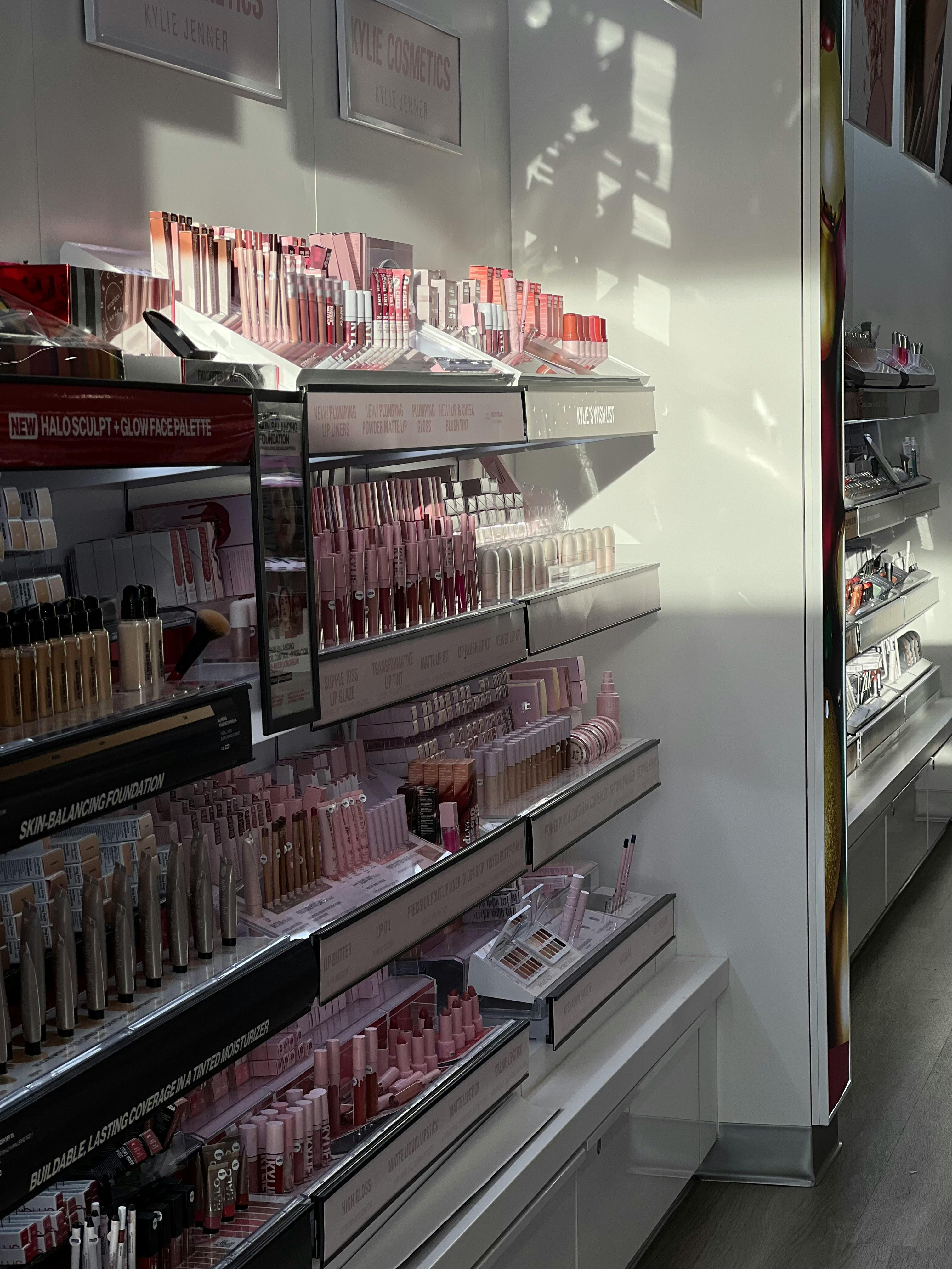
The strongest criticism of Shoppers Drug Mart focuses on layout and product emphasis. In many refreshed locations, front-of-store space appears increasingly dedicated to cosmetics, skin care, and seasonal displays. That shift reflects where margins are strongest in retail, but customers who rely on the chain for convenience say essentials can now feel secondary.
Another common complaint is wayfinding. Shoppers Drug Mart built its reputation on predictable shopping patterns, where regulars could quickly find medicine, snacks, toiletries, and cleaning supplies. When aisles move, category adjacencies change, or taller displays interrupt sightlines, even a cleaner store can feel harder to navigate.
There is also a psychological element to the redesign. A more upscale look can subtly change how customers perceive prices, even before they check a shelf tag. In a period when Canadians are already highly sensitive to grocery and household costs, a store that feels more premium can trigger skepticism about whether it still serves everyday needs first.
What changed inside No Frills locations

No Frills faces a more delicate balancing act because its brand is built so heavily on utility. Customers expect bright warehouse lighting, straightforward signs, and an environment that signals savings over style. When redesigns soften that rougher image, some shoppers feel the chain is tampering with the very cues that made it trustworthy.
Reports from customers often mention tidier produce sections, updated signage, revised aisle layouts, and a more branded visual identity. None of those changes are inherently negative. In fact, they can improve consistency across locations. The problem is that discount shoppers often use visual shorthand to judge value, and a more polished environment can weaken that signal.
This reaction is especially sharp in Canada's current economic climate. Many households are scrutinizing every grocery trip, comparing sizes, promotions, and private-label alternatives more closely than before. In that context, even cosmetic upgrades can invite suspicion if customers believe the cost of those improvements will eventually show up in prices.
Why design matters more than retailers sometimes expect

Retail design is not just decoration. It influences how quickly people can shop, what they notice first, and whether they feel a store understands their priorities. Experts in consumer behavior have long noted that layout, lighting, and signage shape both spending and trust, especially in routine retail environments like pharmacies and discount grocers.
That is why backlash over redesigns should not be dismissed as resistance to change. For repeat shoppers, a familiar layout is part of the service itself. Parents grabbing medicine, seniors picking up prescriptions, and workers making quick food stops often value speed and predictability more than a more fashionable interior.
Design also carries symbolic weight. At Shoppers Drug Mart, a more premium presentation can suggest a tilt toward higher-margin discretionary products. At No Frills, cleaner branding can blur the line between discount retail and conventional grocery. In both cases, shoppers are reacting not only to what they see, but to what they think the redesign says about the company's priorities.
The business logic behind these updates

From the retailer perspective, these redesigns are not random. Chains regularly update stores to improve traffic flow, highlight profitable categories, modernize aging locations, and create a more uniform brand experience. Shoppers Drug Mart has strong incentives to elevate beauty and wellness areas, while No Frills benefits from making stores feel organized and operationally efficient.
There are practical reasons for layout changes too. Retailers may be responding to supply chain realities, theft prevention concerns, or the growing role of self-checkout and digital promotions. Fixtures, aisle widths, and display placement can all be adjusted to support those goals, even if customers experience the result as less intuitive.
Still, good business logic does not automatically translate into customer approval. The most successful redesigns preserve what shoppers already value while improving weak points quietly. When the update becomes too visible, or appears to conflict with a brand's core identity, it can quickly feel like the company is redesigning the experience for itself rather than for customers.
What Canadians will be watching next

The next test is whether these chains respond to the criticism with practical adjustments. If Shoppers Drug Mart improves navigation, restores visibility for everyday essentials, or better balances beauty with convenience, some complaints may ease. If No Frills maintains its discount identity while refining store operations, shoppers may become more accepting over time.
What Canadians are really asking for is not old-fashioned design for its own sake. They want stores that are easy to use, clearly priced, and aligned with the reason people shop there in the first place. In that sense, the backlash is less about resisting modern retail than about defending function.
That makes this more than a debate over paint, shelving, or signage. It is a reminder that in essential retail, design must support trust before it supports image. When customers feel that balance slipping, they notice quickly, and they are not shy about saying so.




Leave a Reply