
A grocery trip can feel routine, but the store around you is anything but accidental. Retail experts, consumer researchers, and food industry sources have long shown that product placement, pricing signs, and even music can influence what goes into a cart.
Eye level is prime real estate
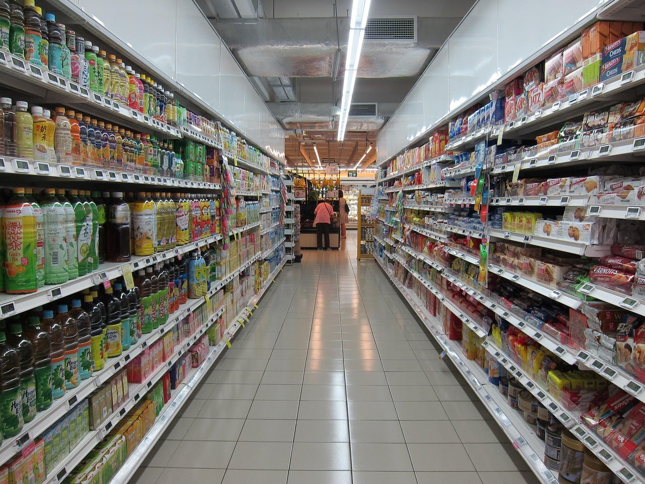
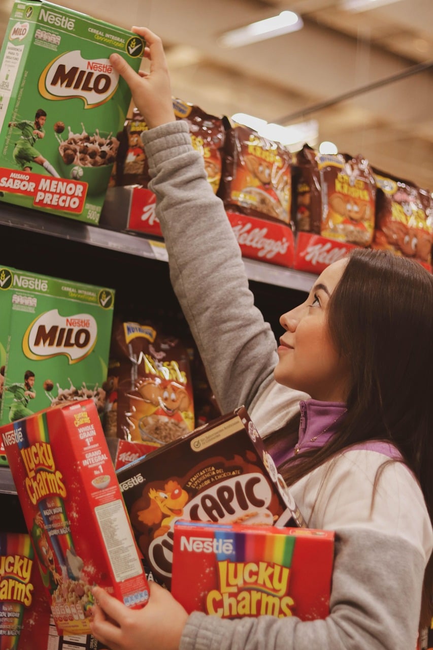
The shelves in front of you are often arranged to do more than hold products neatly. Retail analysts have long described eye level placement as premium shelf space because items placed there are more likely to be noticed first and chosen faster.
Brands often pay fees known as slotting allowances to secure strong placement, especially in crowded categories. That helps explain why a familiar, higher priced cereal or snack may sit directly in your line of sight, while cheaper store brands are lower or higher on the shelf.
Children's products add another layer. Items marketed to kids are often placed at a child's eye level, which can increase pester power during family shopping trips. A quick scan up and down the shelf can reveal better prices that are easy to miss at first glance.
End caps are built to stop you
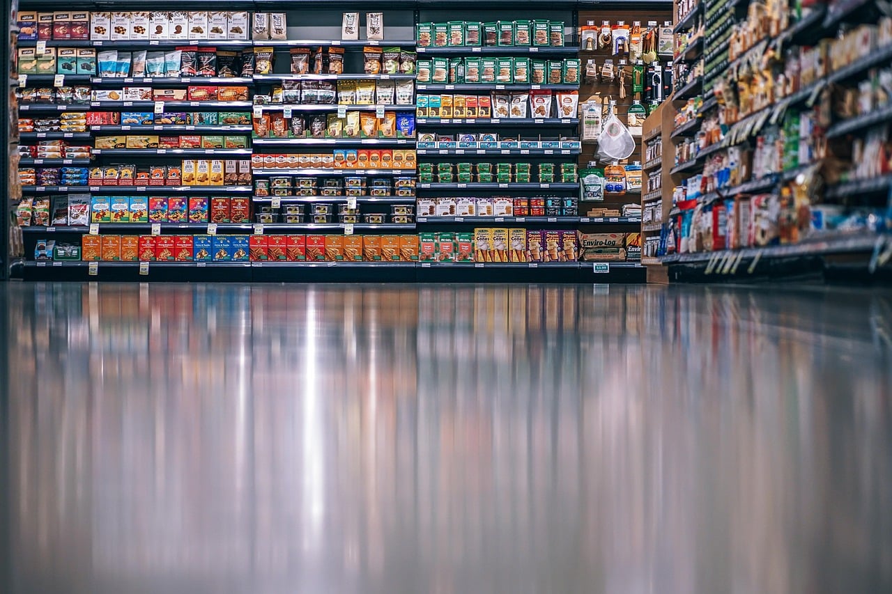
An end cap, the display at the end of an aisle, looks like a convenient spotlight on a great find. In practice, it is often a paid promotional space designed to interrupt the flow of traffic and push attention toward a specific product.
Retail consultants frequently note that end caps can lift sales because they catch shoppers who never planned to enter that aisle. That extra visibility does not automatically mean the item is the best value, the newest product, or the most needed purchase.
Sometimes an end cap highlights a seasonal item or a genuine sale, but it can also feature products with healthy profit margins. Comparing the unit price on the shelf tag, not just the large sale sign, is often the easiest way to see whether the display is actually a bargain.
Unit prices tell the real story
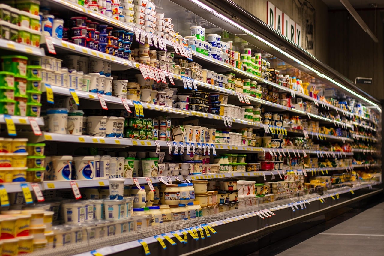
Big package labels are designed to be read quickly, but quick is not always clear. Consumer experts regularly urge shoppers to use unit pricing, the cost per ounce, pound, or other standard measure, because it reveals comparisons that sticker prices can hide.
A larger package can look like the smarter buy while costing more per unit than a smaller size on the same shelf. Temporary sales can create the same illusion, especially when a bright sign emphasizes total savings instead of the price per ounce or per count.
Many state and local consumer protection offices encourage stores to display unit prices for this reason. When brands shrink package sizes but keep prices similar, a practice often called shrinkflation, unit pricing becomes one of the simplest tools shoppers have to spot it.
Store brands are often closer rivals than they seem
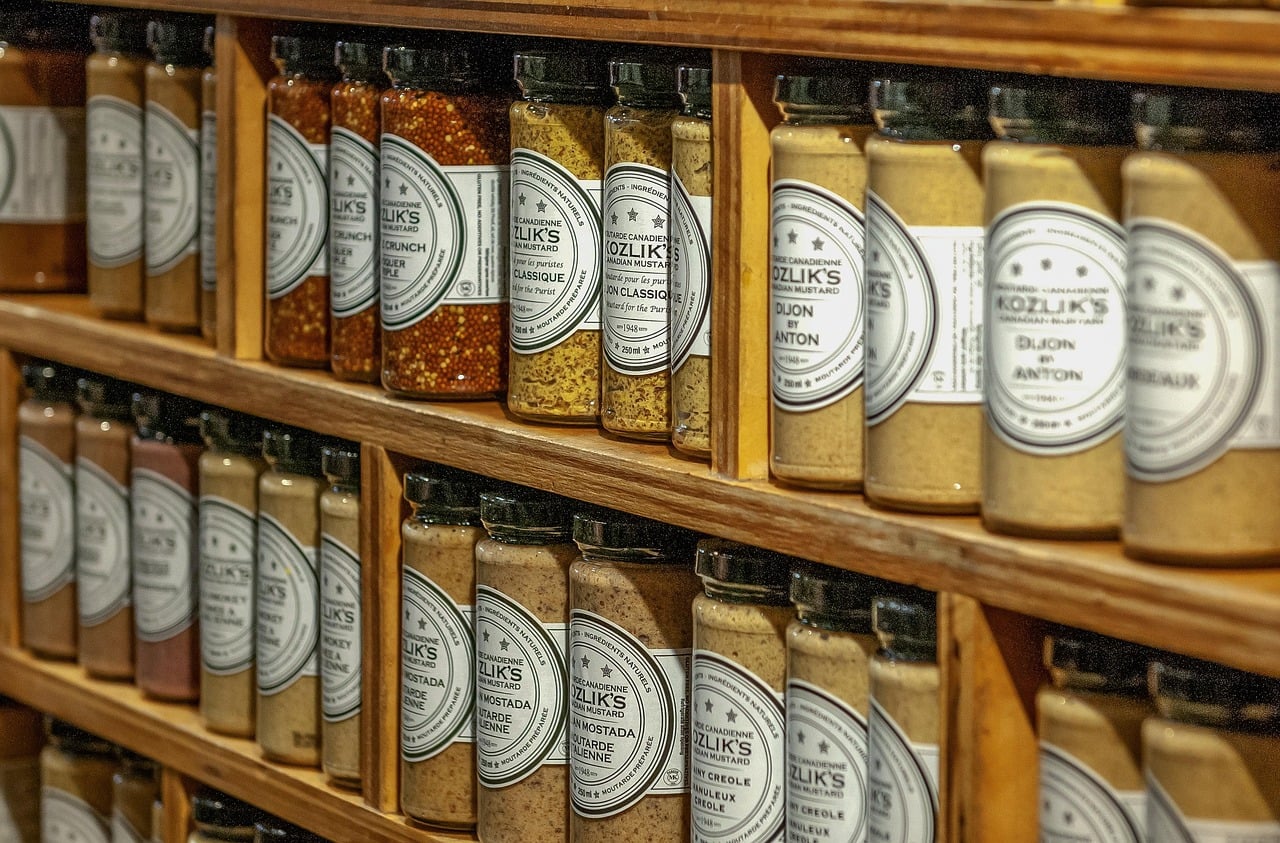
Generic used to suggest plain packaging and a noticeable drop in quality. Today, many store brands are positioned as direct competitors to national labels, and in some categories they are produced by major manufacturers that also make branded goods.
Private label products are attractive to retailers because margins can be stronger than on national brands. The Private Label Manufacturers Association has long pointed to growth in store brands as shoppers become more comfortable treating them as standard choices rather than fallback options.
That does not mean every store brand is identical to its brand name neighbor. Recipes, ingredients, and sourcing can differ. Still, the gap is often smaller than packaging suggests, which is why comparing ingredient lists and unit prices can be more useful than relying on branding cues alone.
Checkout lanes are made for impulse buying
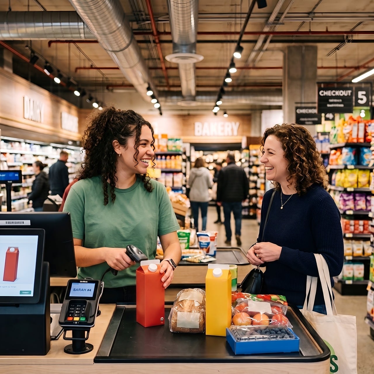
The checkout area is one of the most studied parts of a supermarket. By the time shoppers reach the register, they have already made dozens of decisions, and small treats or convenience items placed nearby are meant to capitalize on lower resistance.
Candy, gum, magazines, drinks, and travel size products are classic examples because they are inexpensive enough to feel harmless in the moment. Retailers know these last minute add-ons can raise the final basket total without requiring much thought from the shopper.
The strategy becomes even stronger when lines are slow. Extra waiting time means more time spent looking at small items within arm's reach. That is why checkout products are usually brightly packaged, easy to grab, and priced to feel like a minor exception rather than a real purchase.
Sale signs can make weak deals look strong
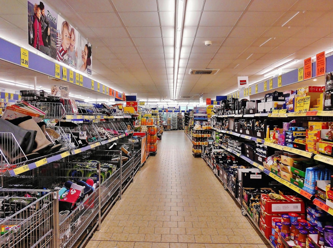
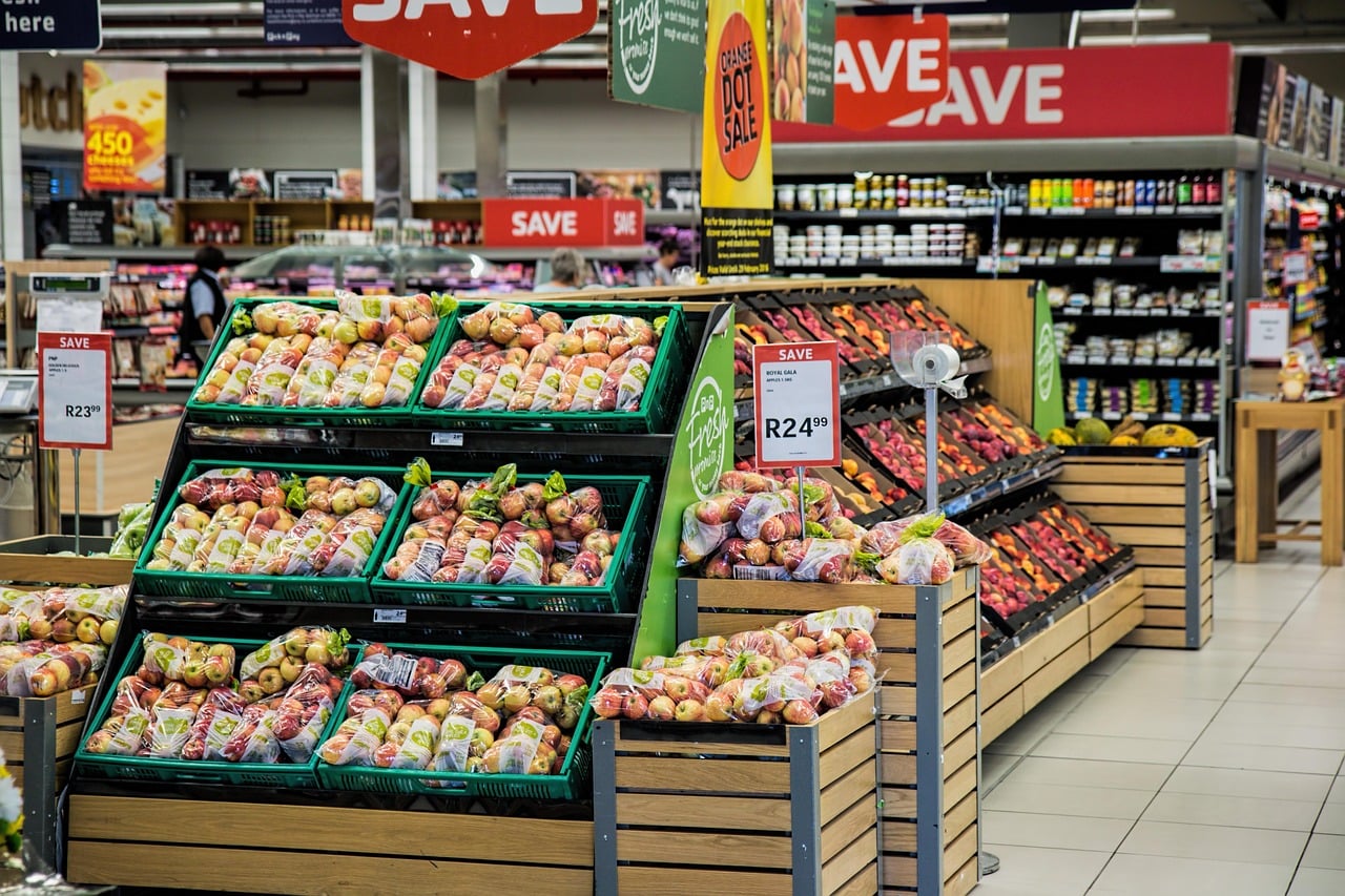
A red sign or a bold percentage can trigger the feeling that money is being saved before the numbers are fully processed. Pricing researchers have found that promotional framing can change how shoppers judge value, even when the final deal is only modest.
Terms such as "10 for $10" can sound like a bulk requirement, even when many stores allow shoppers to buy one item at the same per item price. The sign creates urgency and scale, which can nudge people to buy more than they intended.
Retail insiders also know that a sale sign draws attention even when the discount is small. The smartest check is simple: compare the current unit price with nearby alternatives and make sure the promotion changes the actual value, not just the appearance of value.
Fresh departments are often near the entrance for a reason
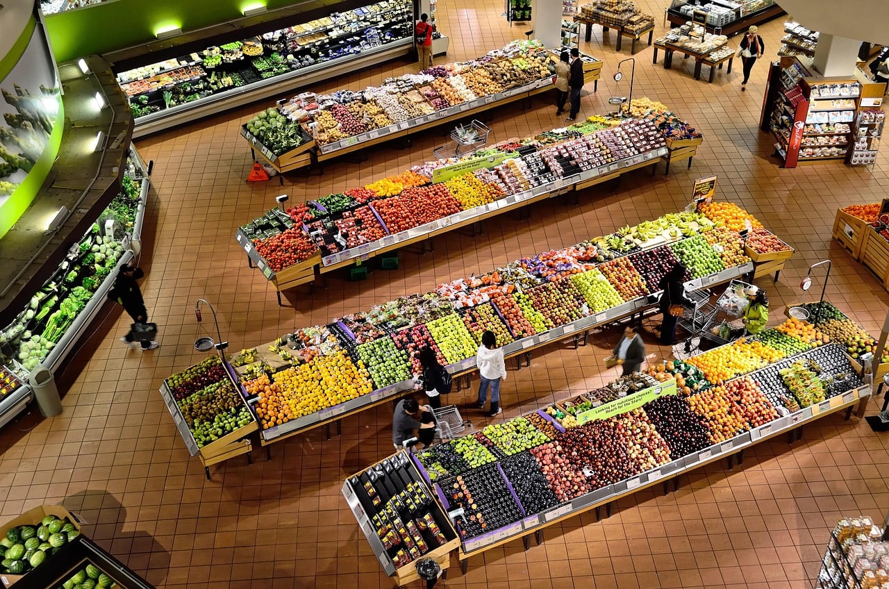
The produce section near the front of the store is not just about refrigeration or convenience. Retail design experts often describe it as a mood-setting area, because colorful fruits, vegetables, and flowers create a strong first impression of freshness and abundance.
That opening impression can shape how the rest of the store feels. A supermarket that smells clean and looks vibrant at the entrance may leave shoppers with a more positive sense of the entire trip, even before they reach packaged foods in the center aisles.
There is a practical side too. Starting with produce can encourage healthy intentions, but it can also slow people down, helping them settle into the shopping environment. The longer shoppers stay engaged, the more opportunities the store has to generate unplanned purchases elsewhere.
Music and atmosphere can affect pace
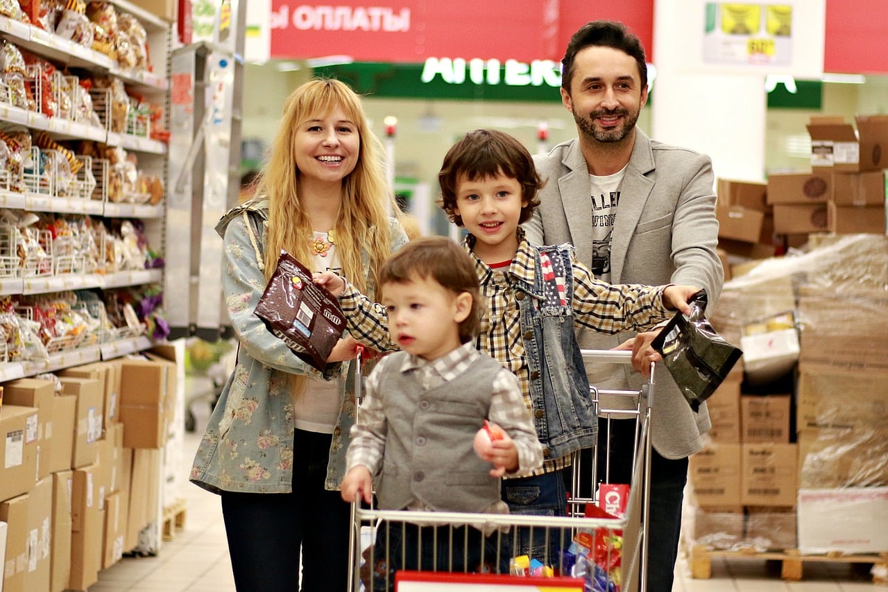
A supermarket soundtrack might seem like harmless background noise, but atmosphere is a real retail tool. Studies in consumer behavior have found that tempo, volume, and overall ambience can influence how quickly people move and how long they stay in a store.
Slower music has been associated in some retail research with slower walking speed and, in some settings, higher spending. Lighting, aisle width, and store scent can work the same way by making the environment feel calm, crowded, rushed, or comfortable.
Retailers do not control every shopper response, but they do pay close attention to the conditions that shape behavior. When a store feels pleasant and unrushed, customers may browse more categories, notice more displays, and add more to the cart than they originally planned.
Staple items are often placed deep inside the store
Milk, eggs, bread, and other basics are frequently placed toward the back or along the perimeter, and that layout is rarely accidental. Store planners use staple items to pull shoppers through more of the floor, increasing exposure to other products along the way.
The logic is straightforward. If the most commonly needed items sat right at the entrance, many customers could complete a fast trip and leave. By placing staples farther in, the store creates more chances for side purchases from snacks, drinks, frozen foods, or household goods.
This tactic is especially effective because staple runs often feel urgent and routine. Shoppers focused on one necessity may pay less attention to how many extra prompts they pass before reaching it, making the final basket larger than the original shopping list suggested.
Limited time displays create urgency
A stack of seasonal cookies, grilling sauces, or holiday candy can create the sense that waiting means missing out. Retailers often use temporary displays and seasonal language to tap into scarcity, a well documented principle in consumer psychology.
Scarcity works because people tend to assign more value to things that seem available for only a short time. In a supermarket, that can turn an ordinary product into a special purchase simply because it appears tied to a season, event, or brief promotion.
Not every limited time offer is a bad buy. Seasonal foods can be timely and useful. The trick is understanding the cue: urgency itself is part of the pitch. Once shoppers recognize that, it becomes easier to separate a genuinely wanted item from a momentary impulse.

Leave a Reply